THE STORY
The heart of communities in the West has always been the church, where congregants have not only worshiped and found greater meaning in their lives, but built their social lives around this hub. However, in recent decades, changing demographics and secularization have depreciated the church’s position as the social locus of society. This phenomenon is particularly conspicuous in Europe where its large, historic cathedrals have become progressively more vacant.
The first response to this phenomenon has been to make the church into a museum. However, a city can only sustain so many museums within its bounds. On the other hand, in the tight urban fabrics of Europe, the existence of a gaping void in the middle of the hustle and bustle is unsustainable, both due to issues of space and resource consumption. Lack of membership also contributes to the deterioration of the building as funds diminish.
But deconsecration also constitutes its own barriers, particularly due to the cherished hallowedness of the building. Furthermore, the actual adaptation of a building typology — replete with architectural idiosyncrasies — poses many spatial, structural, and logistical challenges, not to mention questions of sustainability. The result is a complex web of intricacies that need to be overcome to give new life to churches and cathedrals, where not only their use, but their symbolic value must be taken into consideration in the process.
Communities in Europe in the past few decades have already been filling the void that results when the church no longer functions as the social condenser in society. All across the continent, churches and cathedrals have been repurposed into everything ranging from hotels to disco clubs to skate parks. These examples illustrate that church buildings are more versatile and open to adaptive reuse into diverse new uses than might initially seem. With this in mind, I ask: “What does it take, architecturally, to recontextualize a church within the social fabric so that it can once more serve a positive role in its community but also where the richness of the space is preserved? And in doing so, what can we glean about how architecture can be evocative spiritually or emotionally?”
THE TRAVEL
The Netherlands has the largest ratio of churches that have been converted to a different use; one out of every five has been deconsecrated. In this journey, I explore important precedents of these adaptive reuse projects in the Dutch urban context that convert old churches into diverse program types that serve the community. My aim is to identify the tangible and intangible elements within churches that evoke spirituality, and whether these precedents have preserved these elements or not, while simultaneously gauging the level of urban revival the intervention effectuates. Of course, much of this can be entirely subjective, and I invite the reader to develop his or her own opinion on the following works.
Out of the many extant examples, the churches chosen for this itinerary constitute an eclectic range of programmatic conversions, which start to illustrate the latent versatility of the church in filling a social vacuum.
An important aspect of the ontology of preservation is the relationship of the new structure to the existing church structure. Many of these adaptive reuse projects are completely integrated and irreversible, but several of them are detached structurally and can be removed if the community needs the building to reassume its religious function. Yet others are designed to be flexible in space so as to allow large events throughout the year, including Mass, if need be.
REFLECTION
In my work, I’ve tried to probe how architecture can serve people’s needs while also maintaining an expressive character. The context of this topic — bringing back to life a building that is set within difficult historical, cultural, and architectural and urban contexts — is a fascinating one to continue thinking about the relationship of form and feeling. In this case, how can reuse encapsulate and transcend these issues?
In the re-presentation of established work, we can derive new conclusions about the overarching semantics and logics that are present in our world. I’m excited to present my findings from these travels in a way that can inspire a dialogue about how the heritage we hold so dear and the future which we prepare for can coexist in ways that supplement both.
DePetrus

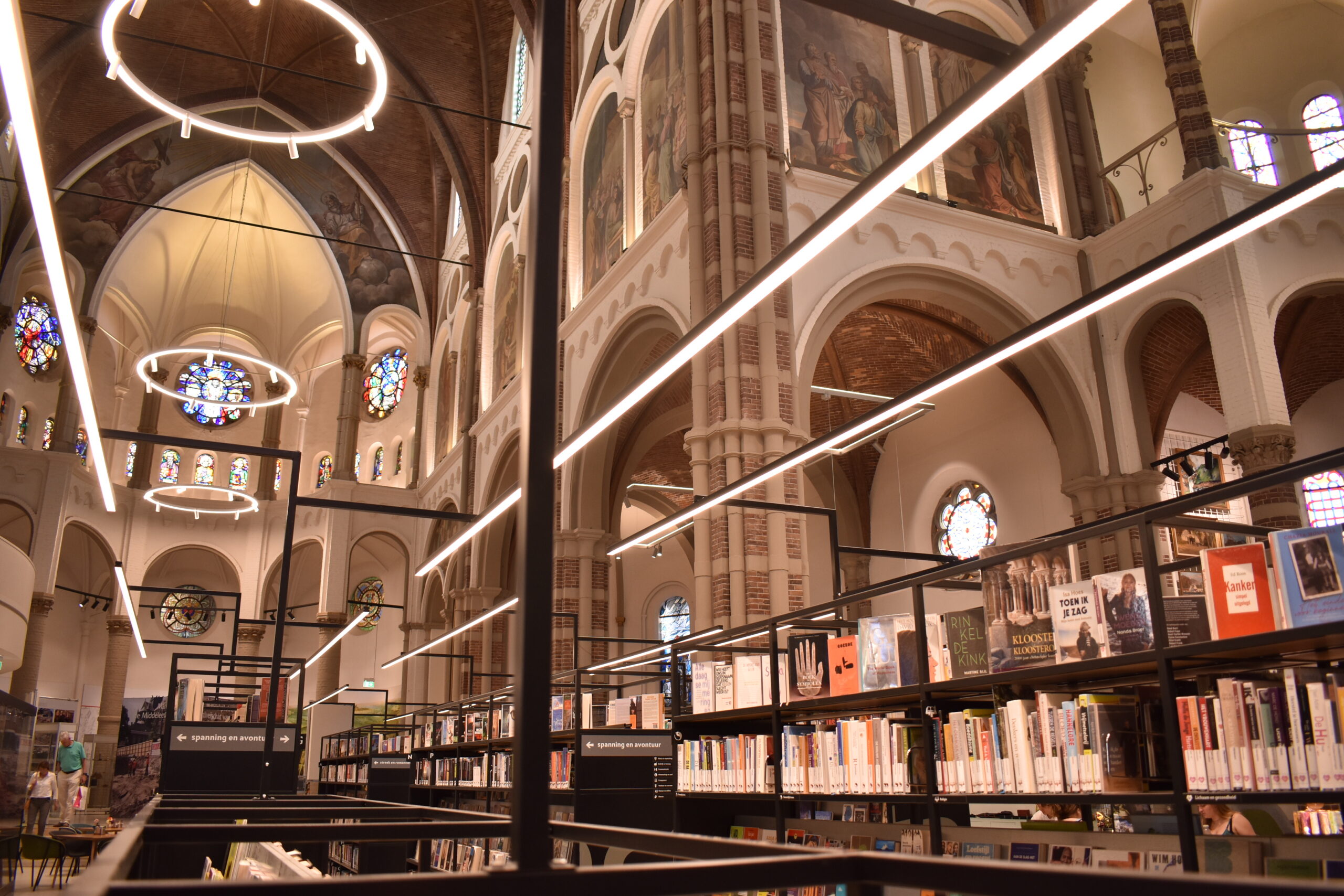
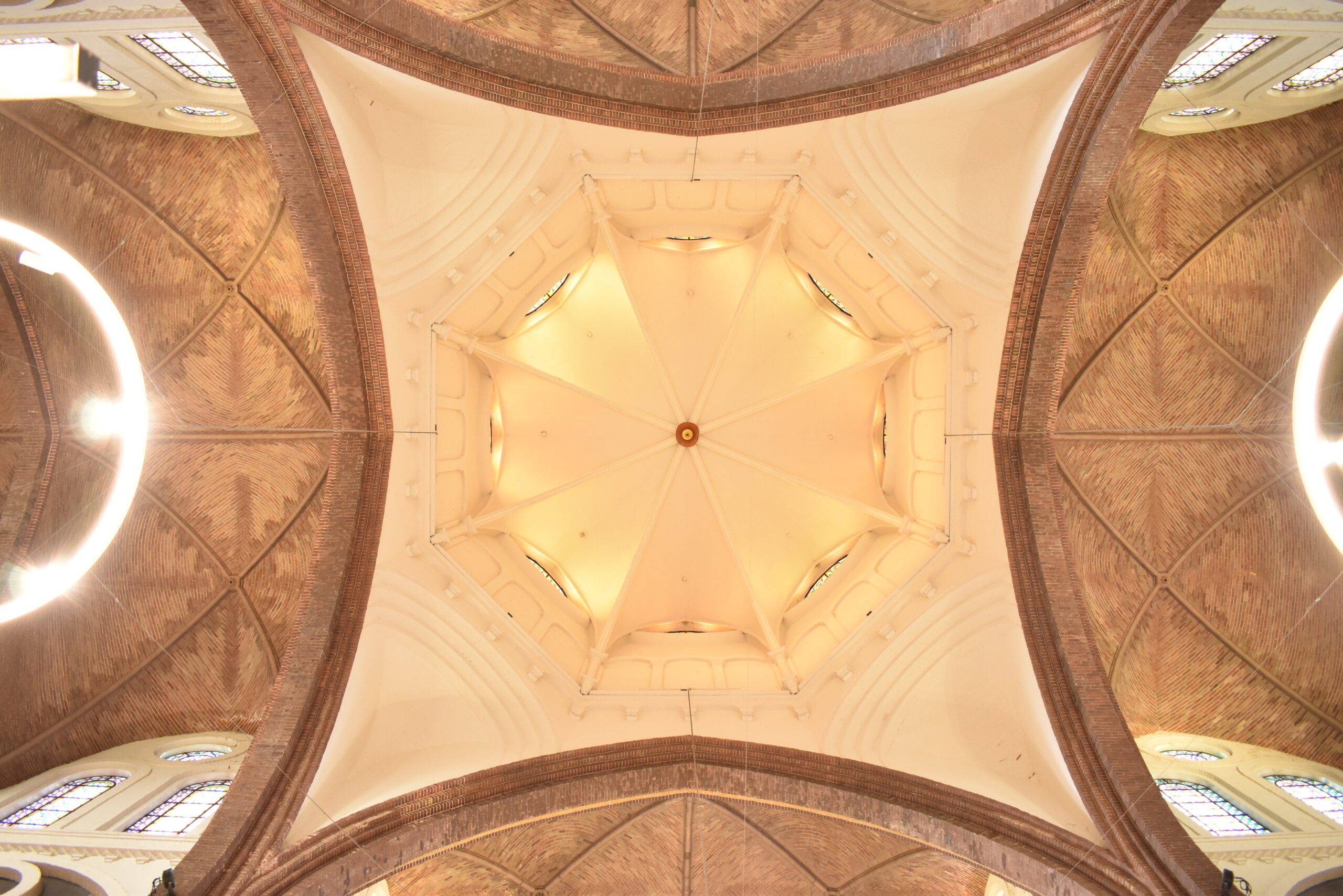
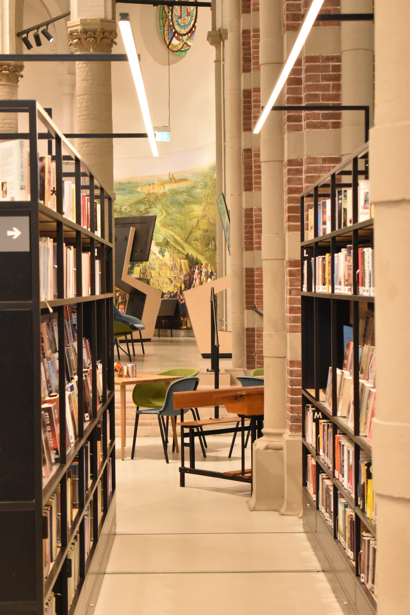

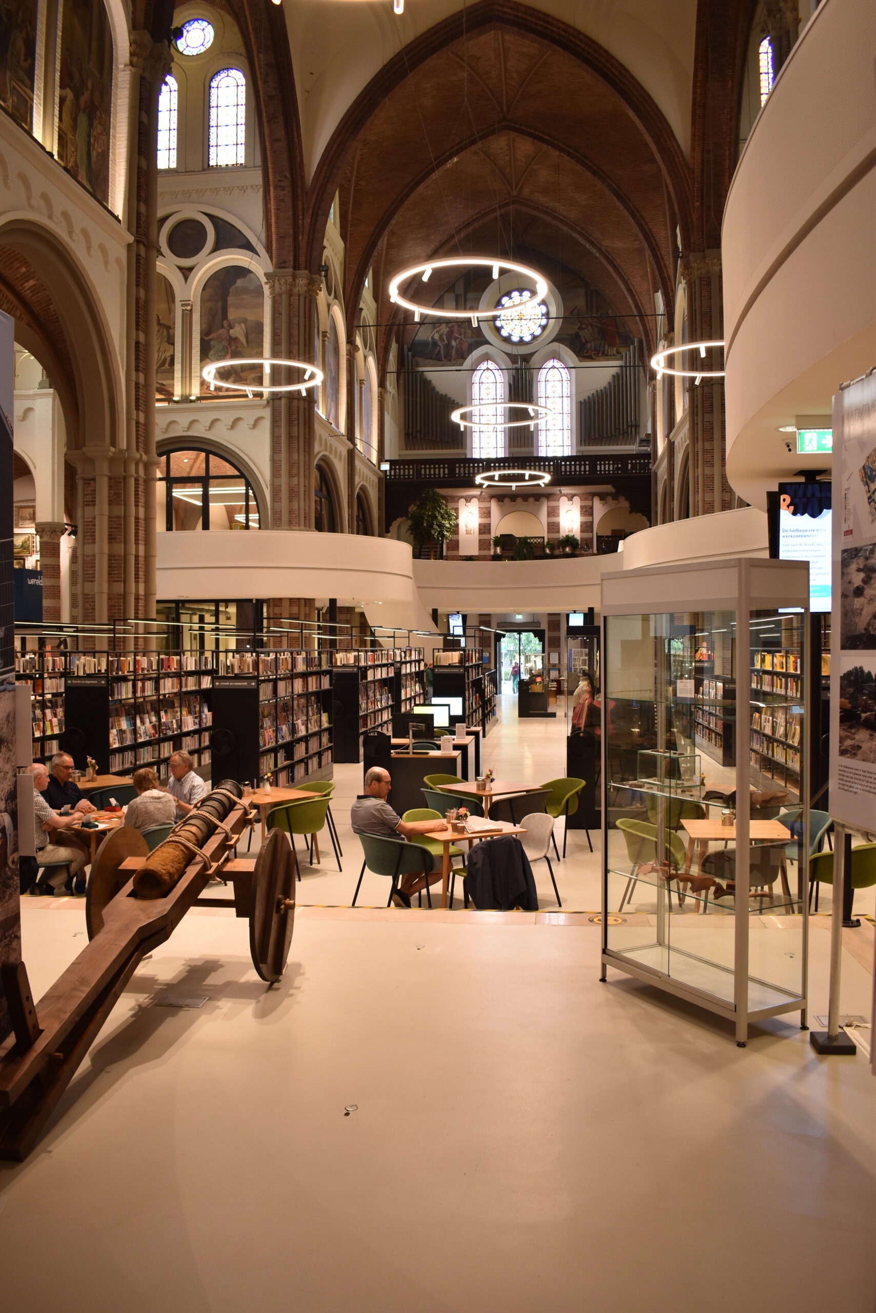
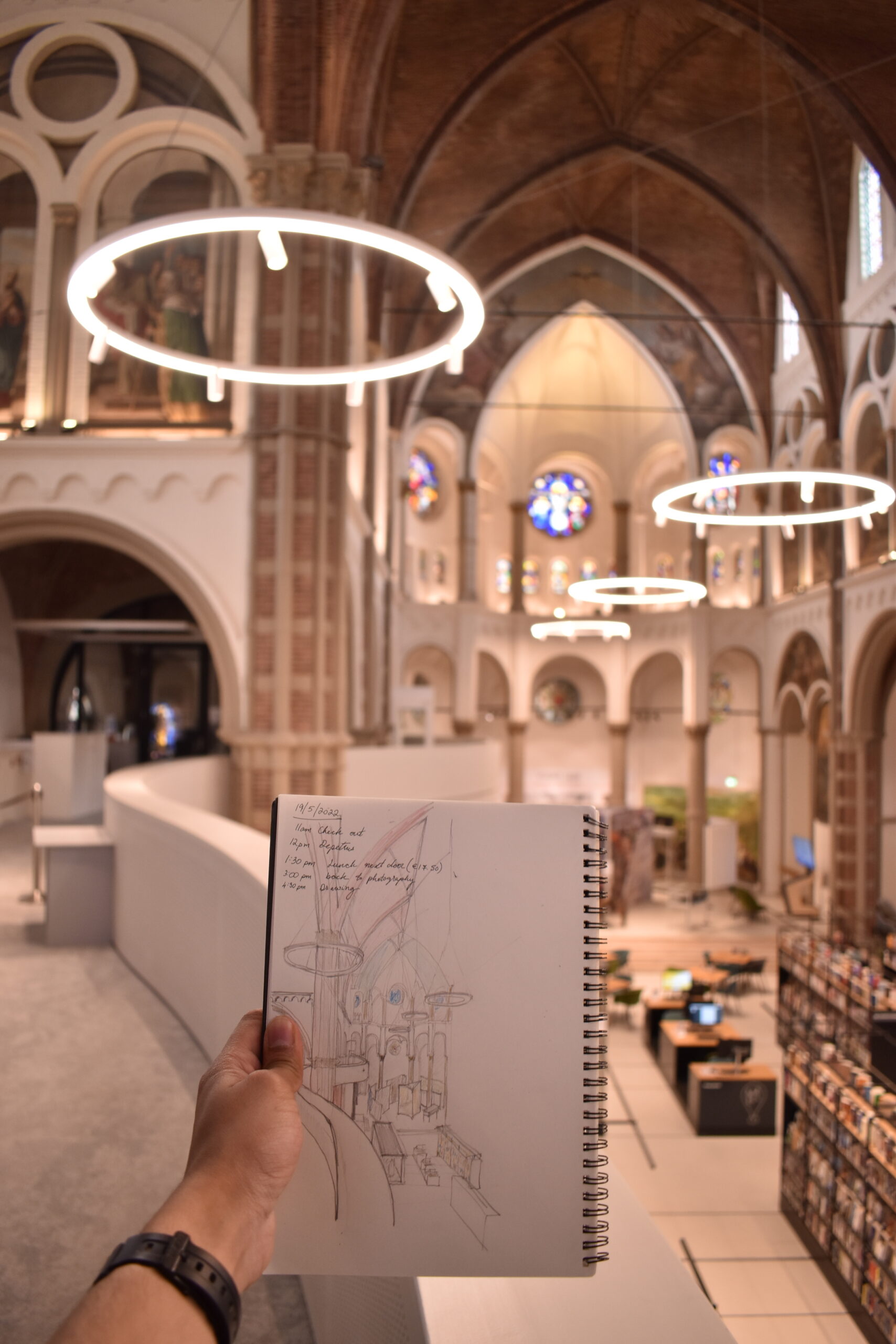
This is truly a community center. All sorts of social activities held here and myriad businesses are housed within its walls. It’s important to note how much the architecture facilitates this. The space has been made to be very customizable, such that the bookshelves can move laterally to open up the space for a variety of social activities – including religious service if it comes to it. The importance of the building in the city’s urban fabric is also emphasized from outside: the stained glass in the tower of the church is lit up so that DePetrus is recognized from far away as an important locus of the city.
Spatially, the programs dispersed throughout the building seem weaved together, so that the whole project seems like a joint community enterprise rather than ephemeral businesses renting space in any old building. The intervention matches the building’s aesthetic seamlessly – its curvilinear form complements the building’s strange clover leaf form in plan while also adding contrast to the rectangular base of the nave.
Colors in the project are done well and match extraordinarily well, while adding a little contrast with the thin frames of the black bookshelves and frames. In general, there are vibrant pops of color everywhere you look. In fact, the interesting thing I wrestled with about this building during my editing process is that I was not able to improve the building’s appearance in the photos no matter what I did to it. Color grading, color tweaking, even brightness and contrast adjustments just made the church look odd. The interior lighting and colors were inherently just so picture perfect in this building that the best photos were those that were untouched – it was them that captured the essence of what it felt like to be inside the space.
The building is fairly new — it’s actually a Romanesque cathedral that the original architect wanted to explore as a formal hybrid between two architectural styles. In its current state, the project is structured as a “ground lease” (erfpacht). Rent money from the businesses occupying different corners of the building goes to upkeep of the physical building. The bishop still owns the building, but signs long term leases so that business(es) can really establish themselves and thrive. At the same time, the intervention can be reversed almost in its entirety, conceding that one day the populace may one day, once again, find the church more suitable as a place of worship.
There’s something really neighborly about the vibe at the church. I have scarcely run into nicer and more kindly people. The elderly ladies running operations at DePetrus took notice of me taking notes and inquiring about the building and made sure to check in with me every once in a while to make sure I was doing okay and getting all I need for my research. Vught is a small town, so naturally it is a small community. The space is open and airy, a bright and happy place to meet for any occasion.
The church’s claim to fame? They had halo lights before tiktok.
Boekhandel Dominicanen
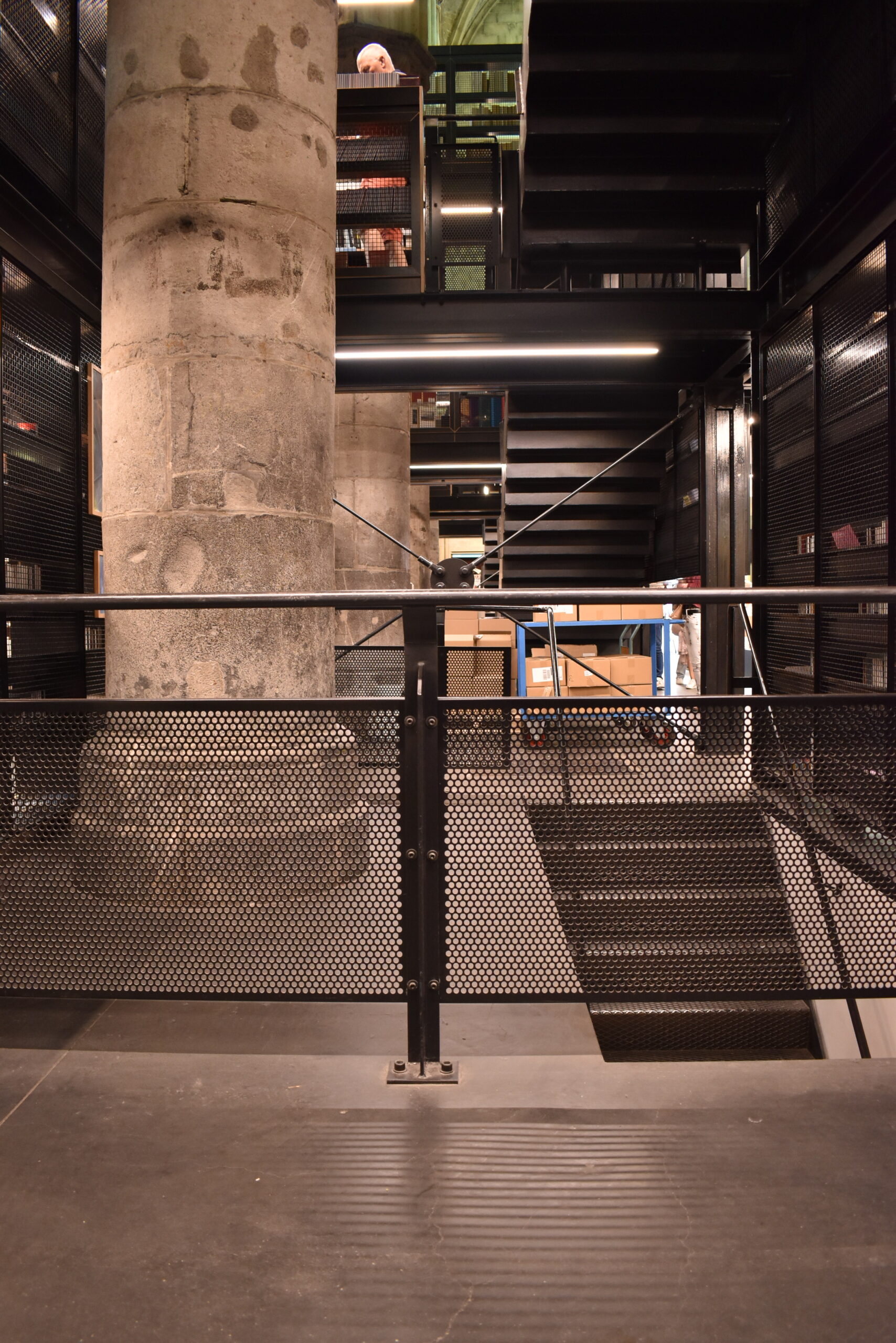
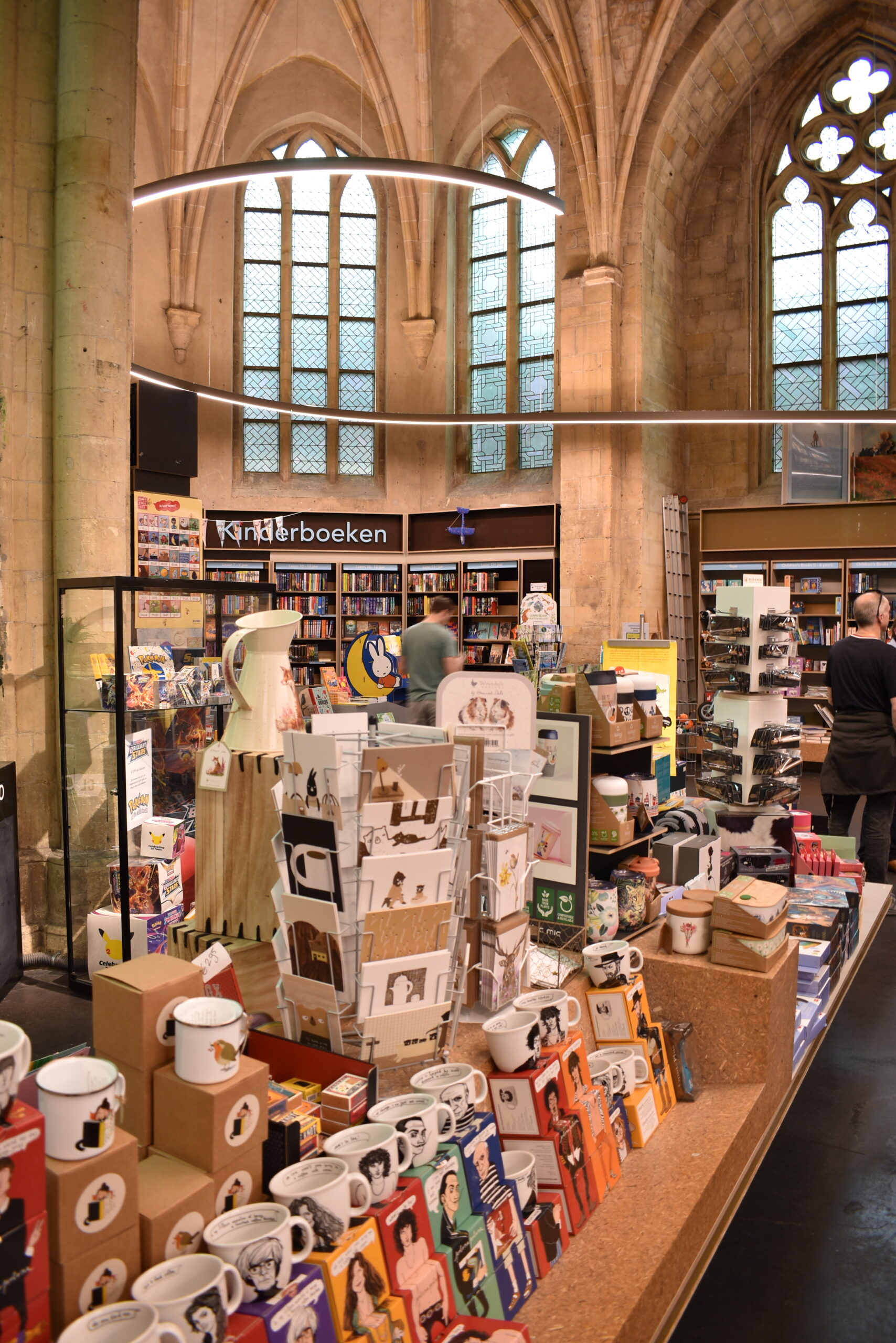
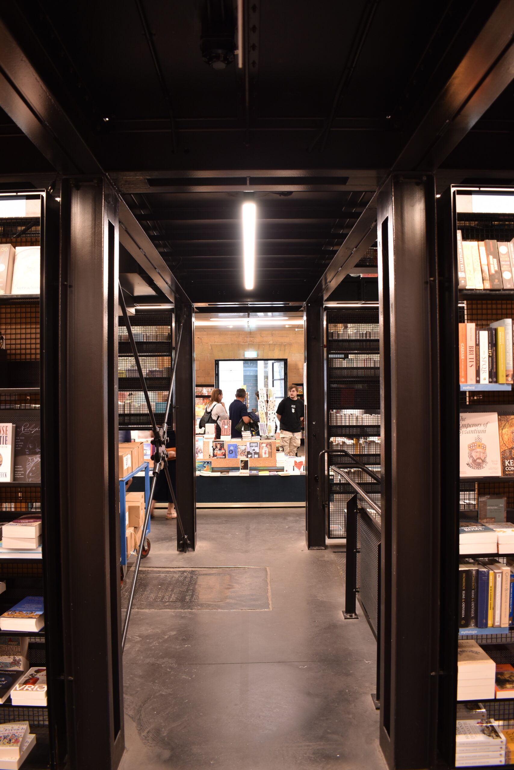
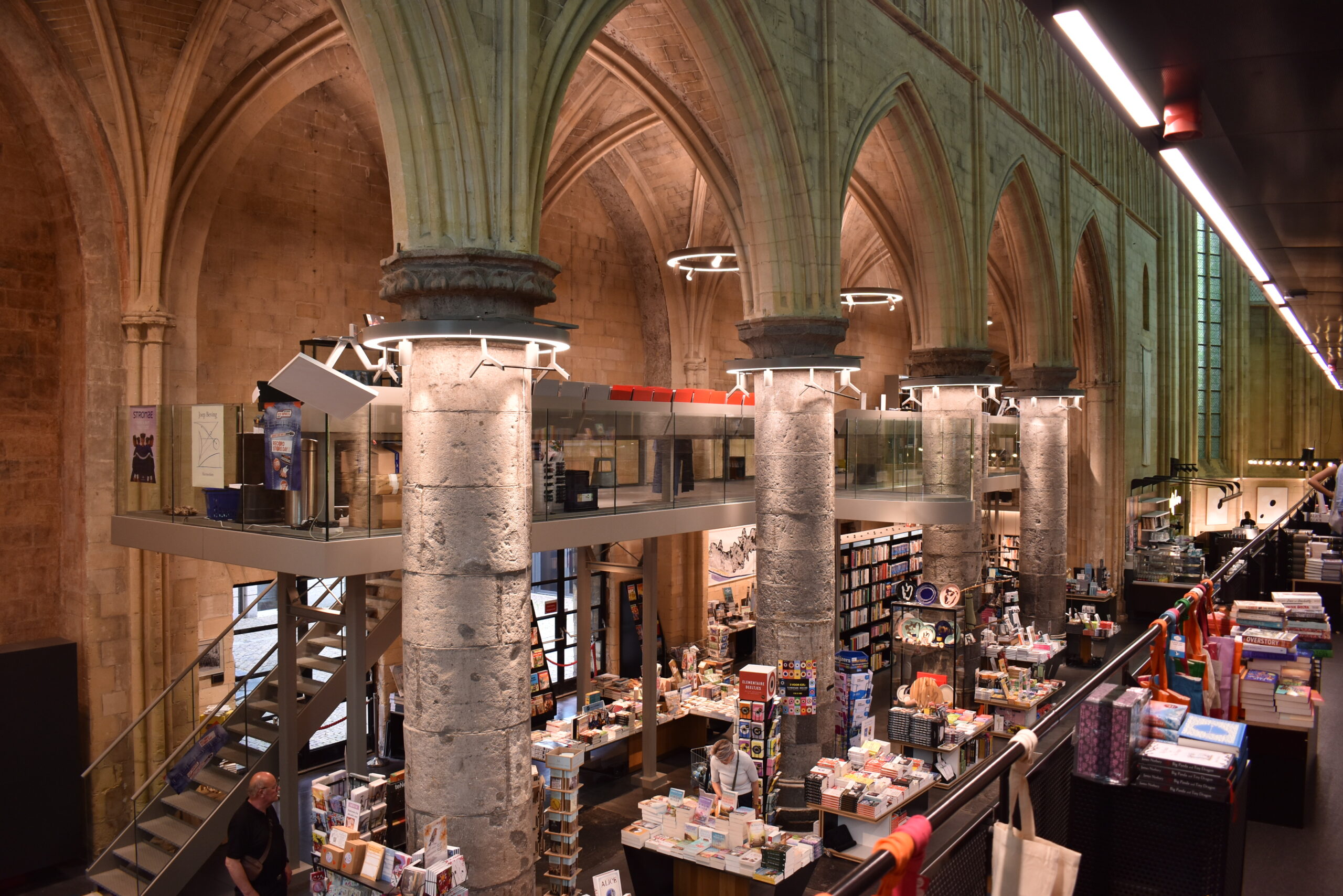
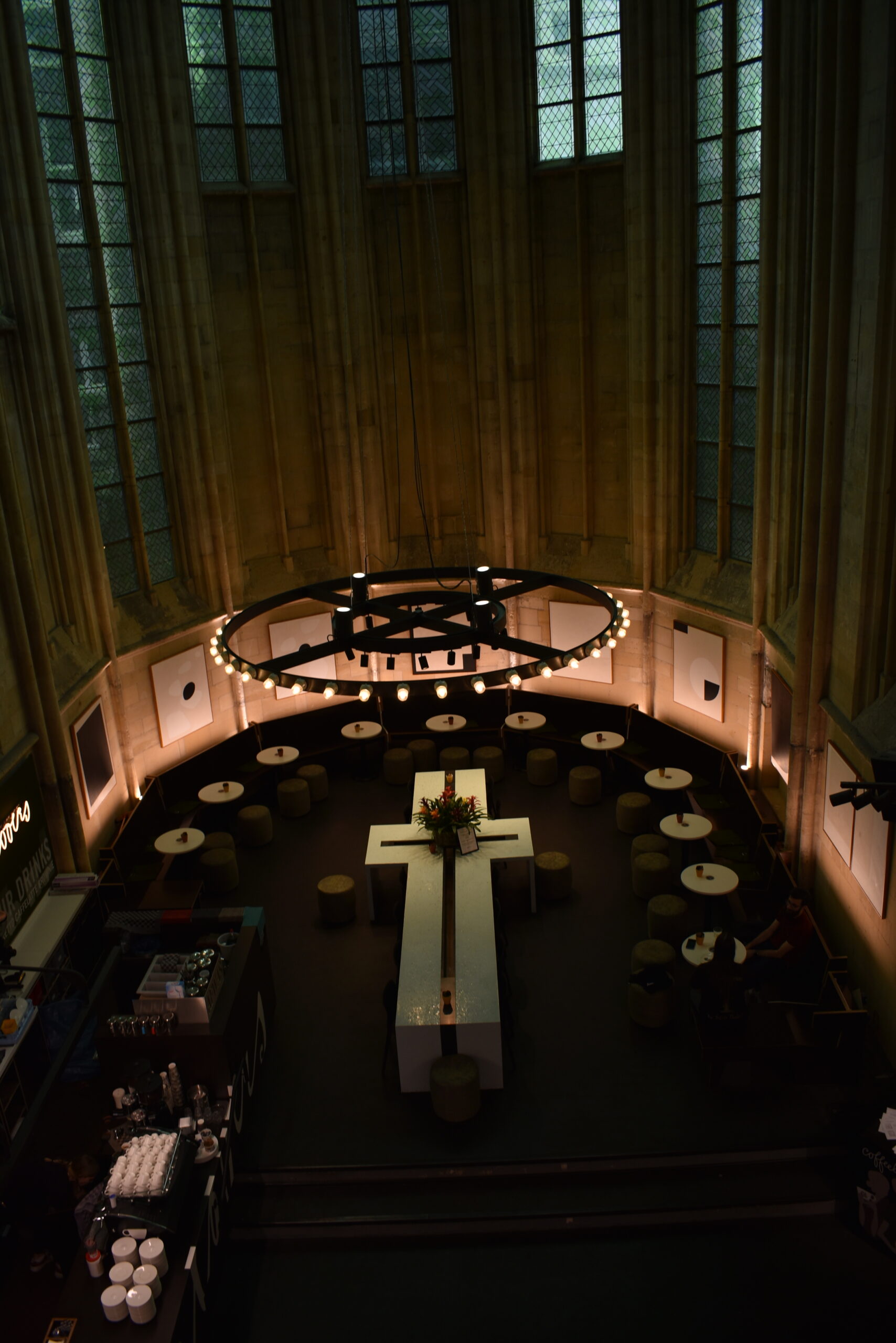
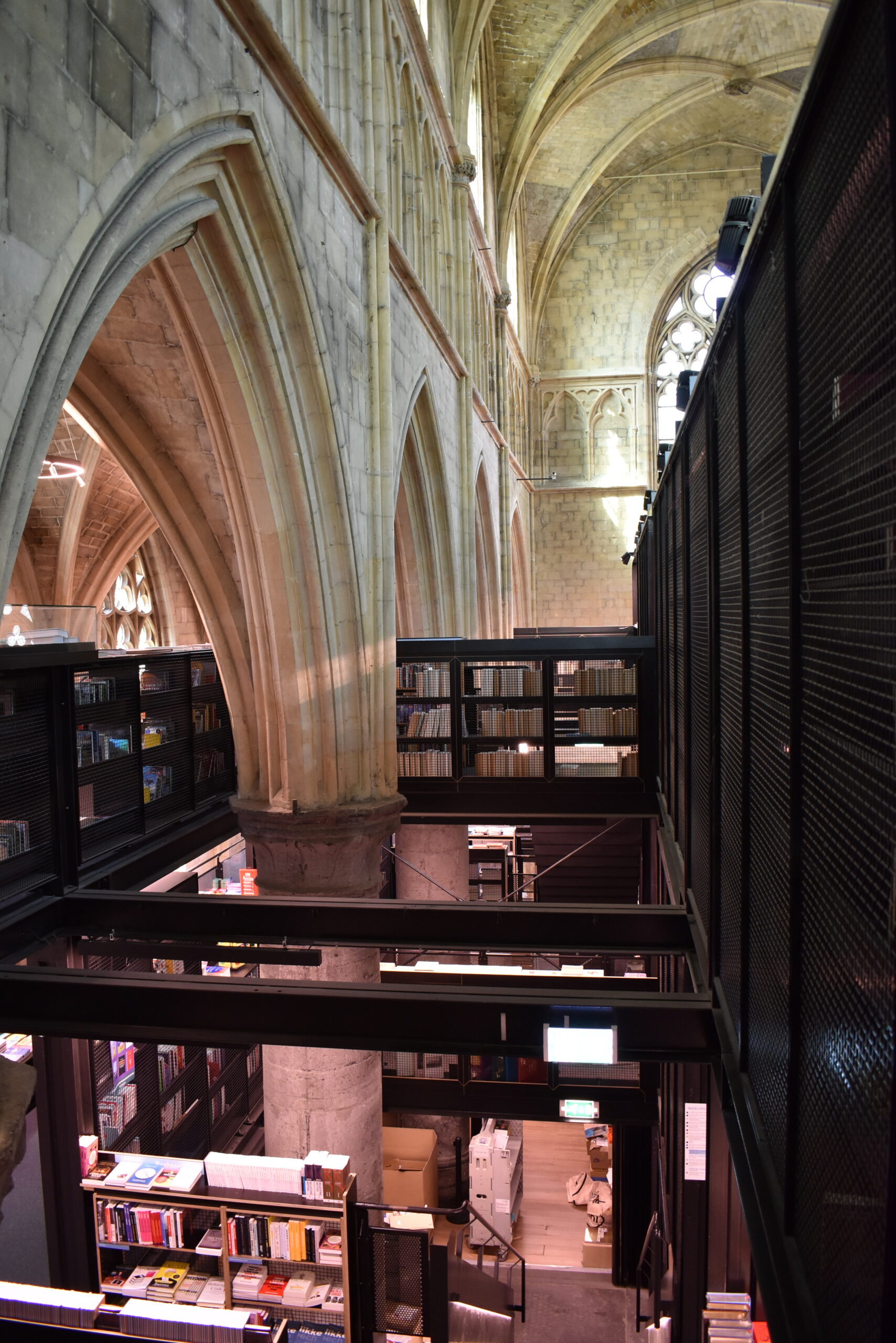
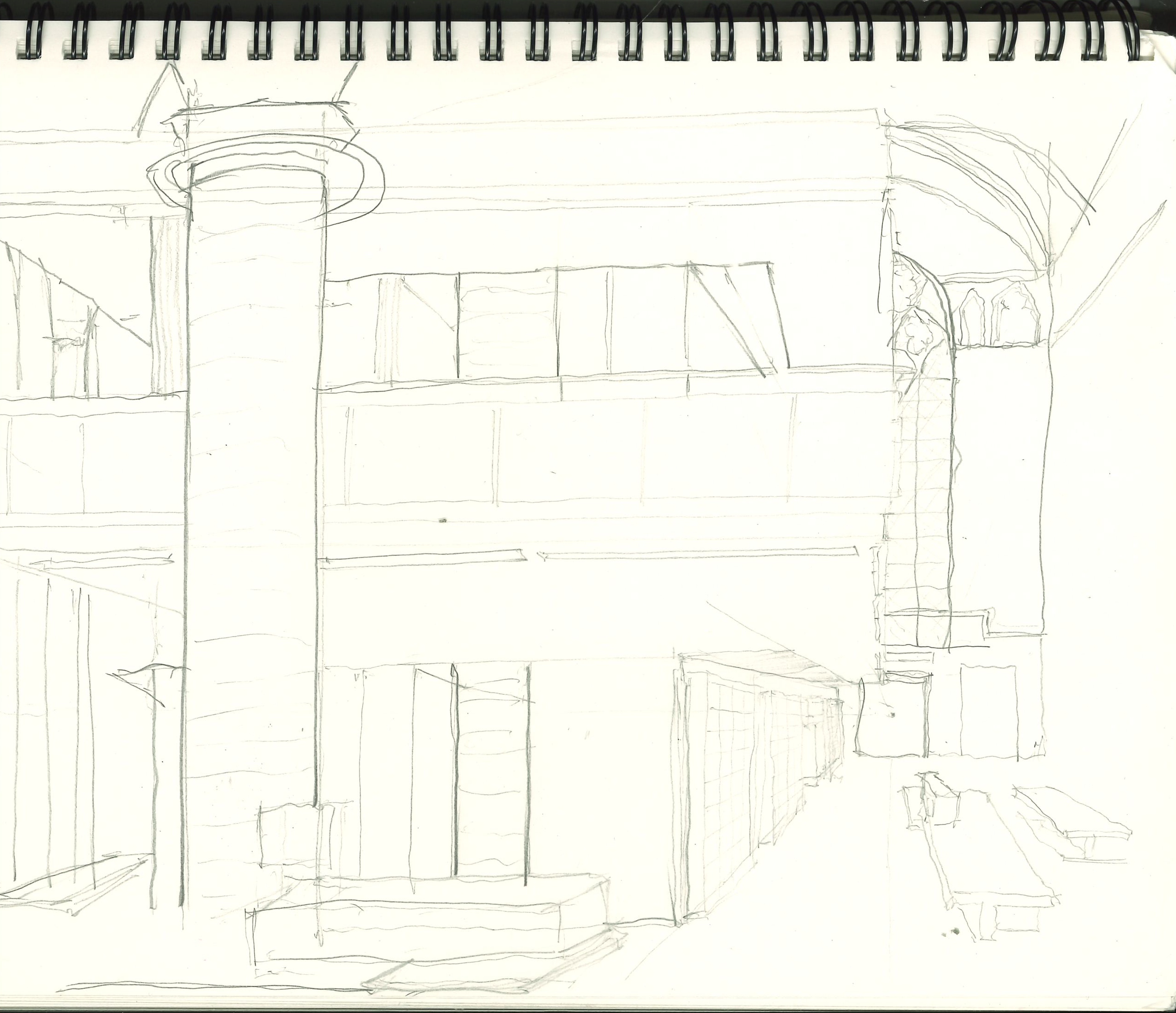
Churches (and religious spaces in general) are directional. This directionality should never be obscured or superseded. The boekhandel (bookstore) affirms the inherent directionality, but then fulfills that axial attention at the altar with a seating area for the café. This could have been the perfect place to showcase a preserved container of worship: a quiet area where people could come pray, meditate … or simply enjoy a book! For the secular leaning, that is worship.
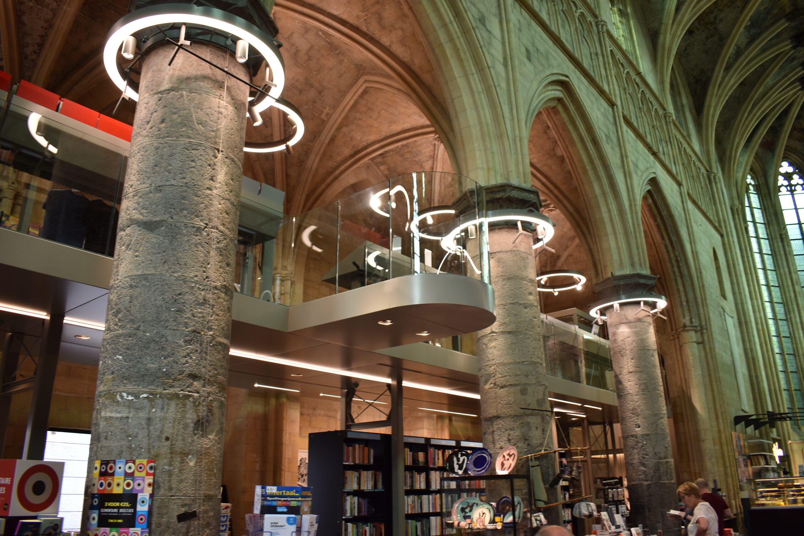
The intervention subsumes half of the building. While technically a brilliant design, it seems a bit parasitic, engulfing the massive stone piers. And although other projects from this collection also occupy the body of the nave with their own interventions, here it feels singularly so because the addition unilaterally compresses the space of the building and shifts its horizontal and vertical centers of balance. Nonetheless, it is a remarkably beautiful project, and I think mostly because of how beautifully colors go together. The black of the new metal matches really well with the dark grey stone and the dark bits in the painted mural ceiling. This is central to making this space so unique. The lighting also is restrained and carefully moderated, preserving just the right level of solemnity and history. In particular, the ring lighting circling the columns is a nice touch.
There’s lots of life here. The books give life to the building in a way the nearby Kruisherenhotel does not. Central to this vivacity is the diversity found at the bookstore. Young and old and folks of all colors clearly enjoy their time here. This is the result of stocking the store with fascinating titles and genres to keep all interests engaged.
In some areas of the bookstore, bookshelves placed along the walls cover up the beautiful church stone and it feels like a step removed from experiencing the church. However, the end result creates cohesive spaces, so it may even be necessary … although you could have backless bookshelves?
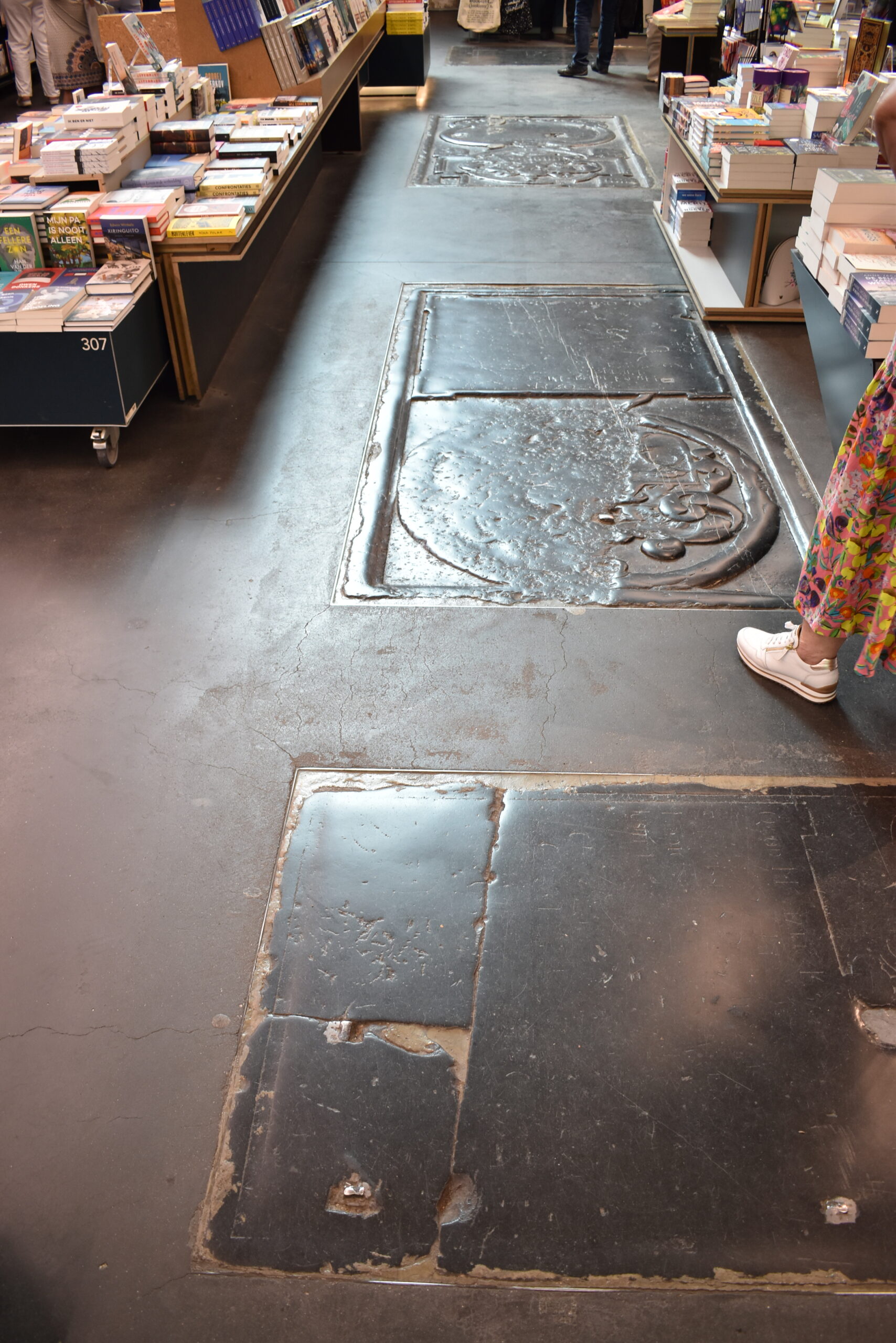
Although patina is a central element to preserving the character of something, in this situation, I felt refinishing/resurfacing of the stone is desperately needed in the building. At this point in the church’s life, I felt there is perhaps not enough patina to justify keeping it this way.
The wow moment for me in this project was the invisible viewing platform placed at the newly created centroid of the tangible space that allows one to reengage the architectural intervention in relation to the church and gives one a new way to experience the church. One of the most beautiful moments is realizing (on the platform) that everybody one sees is on a slightly different level, a fitting metaphor for the visitors who shop.
Kruisherenhotel
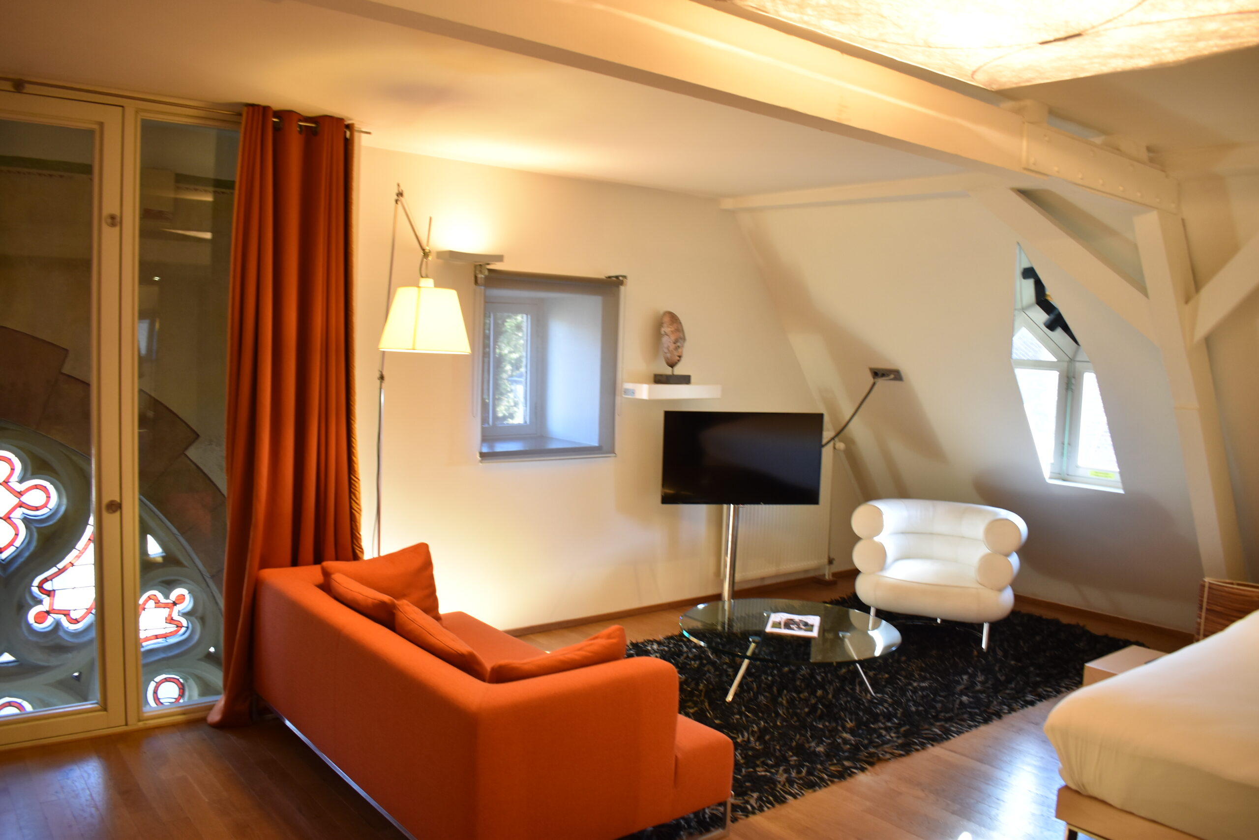
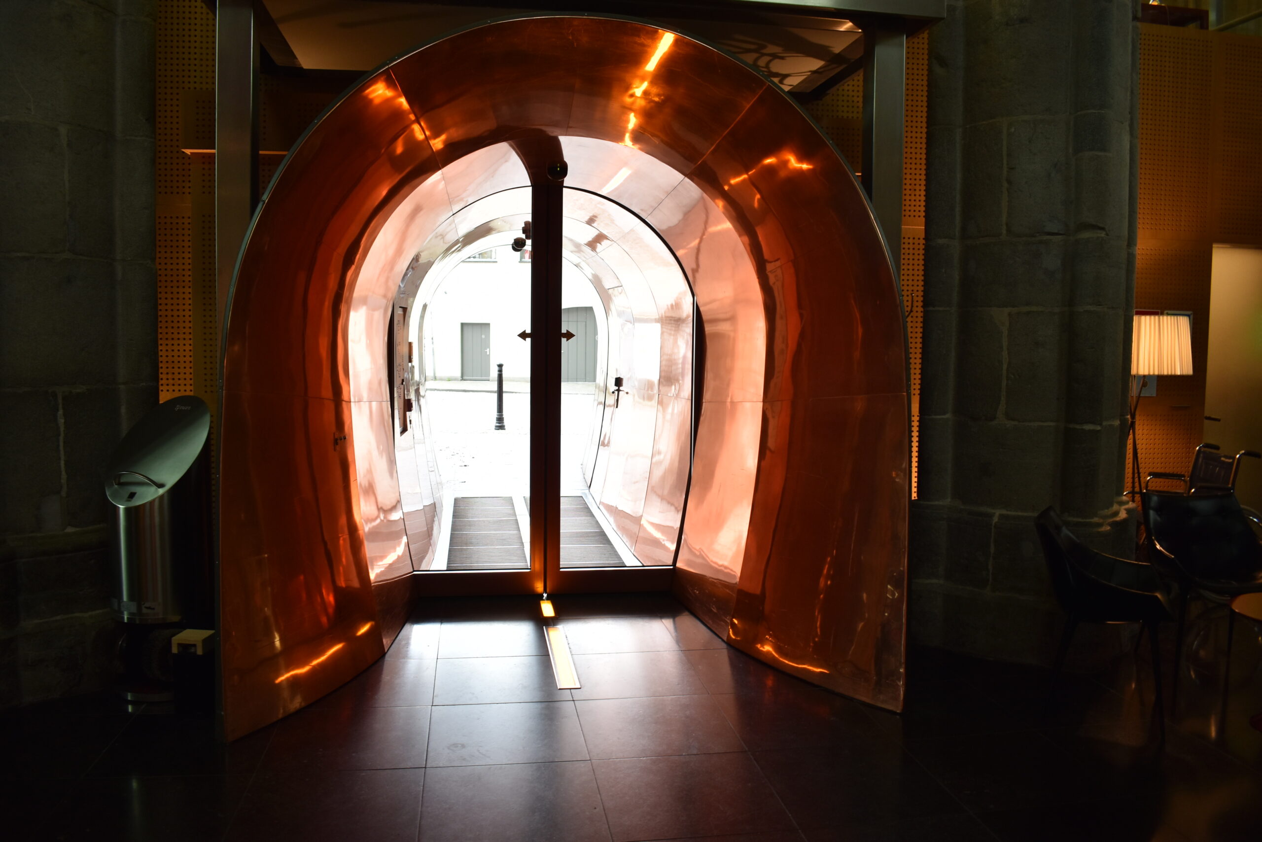
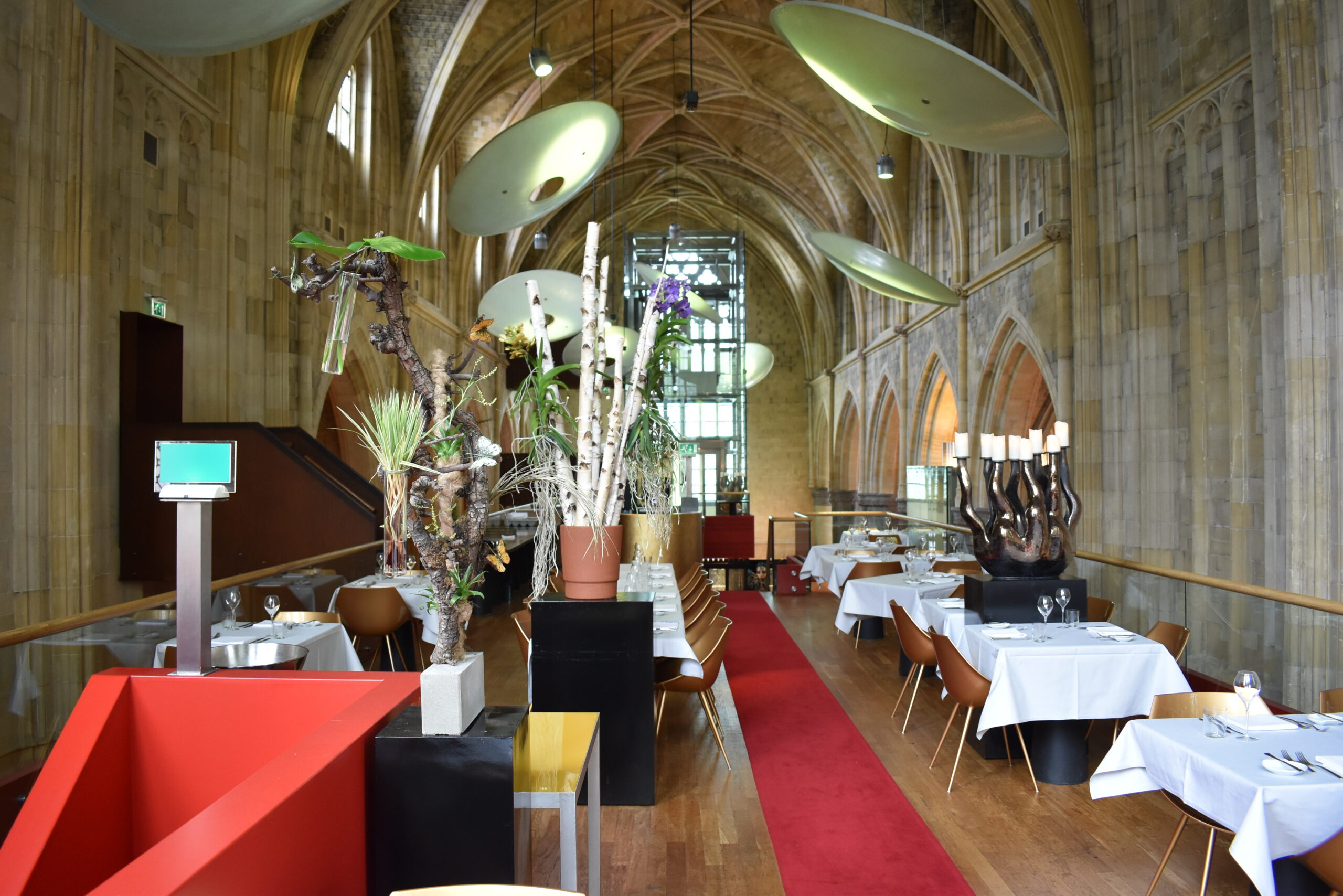
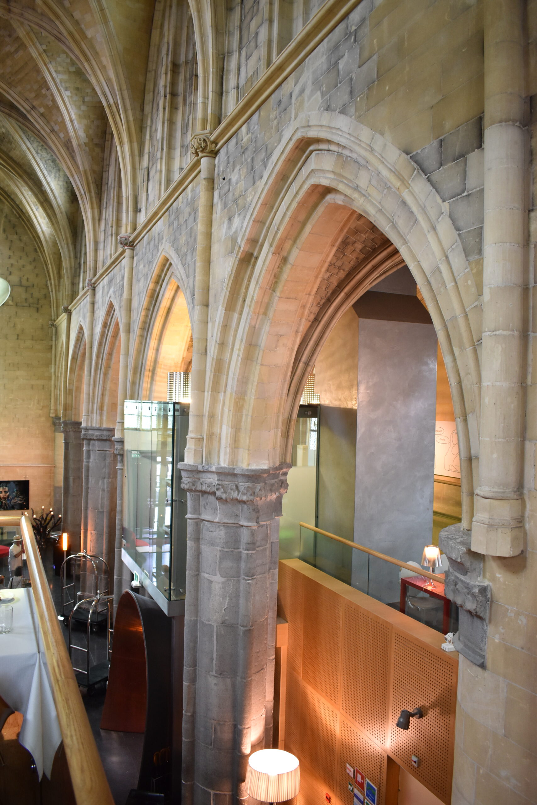
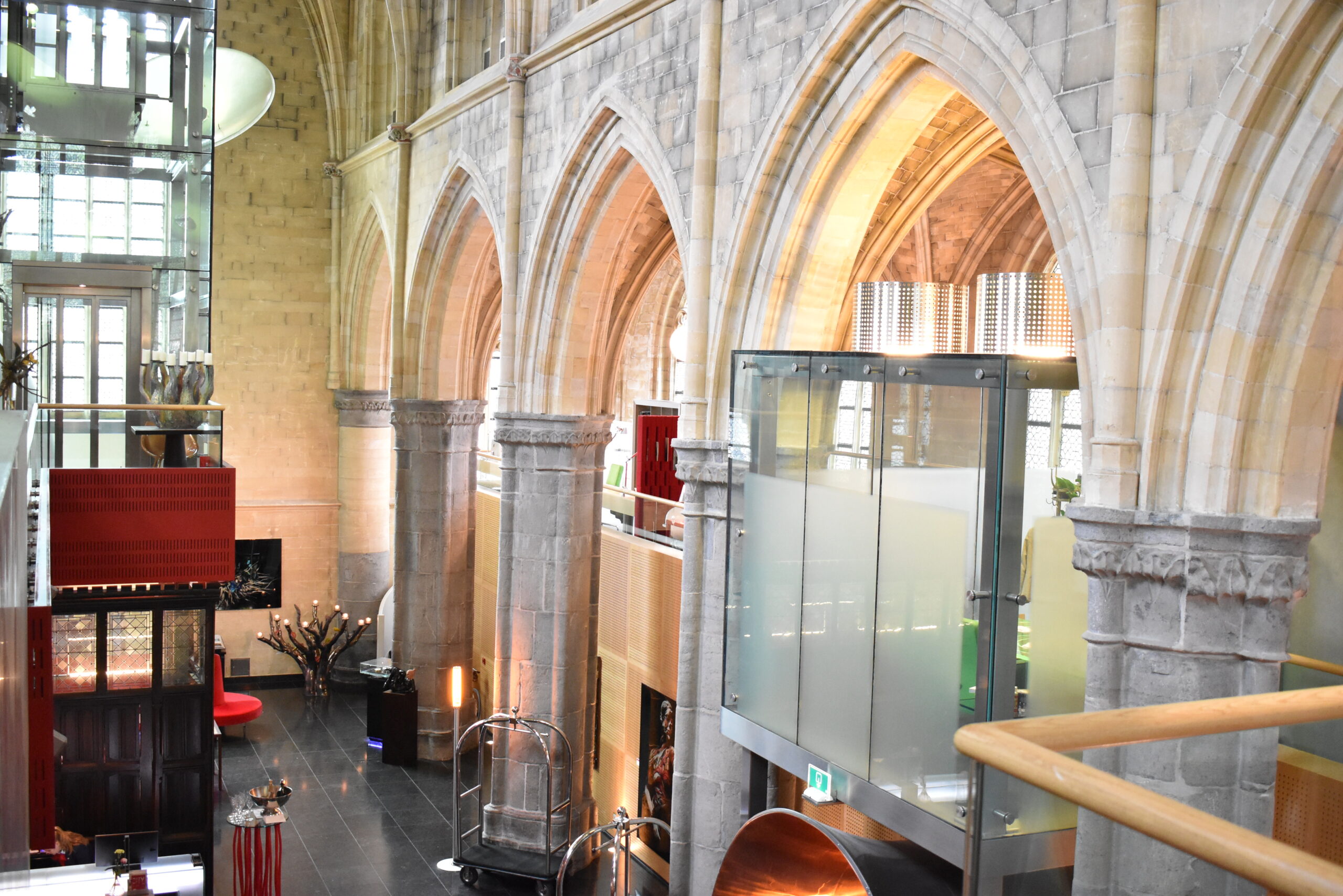
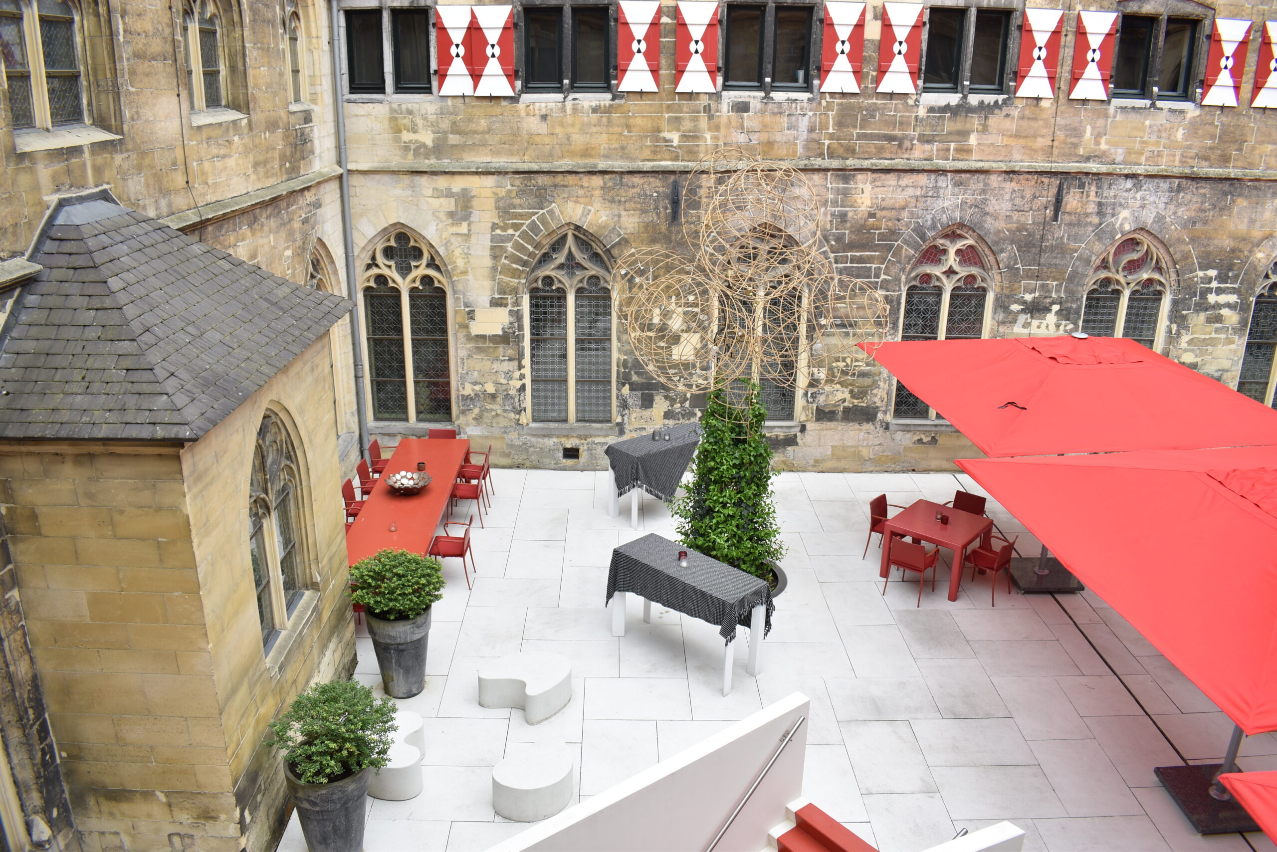
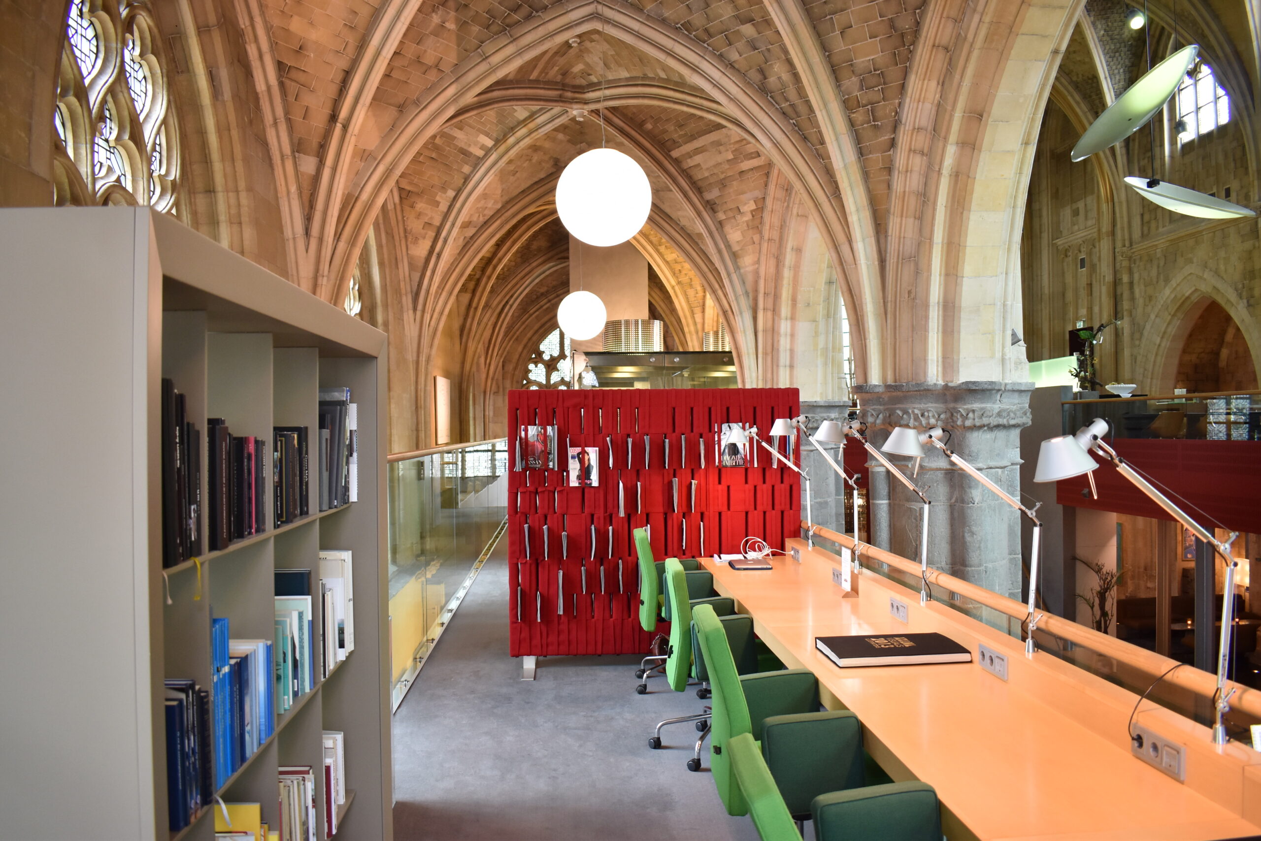
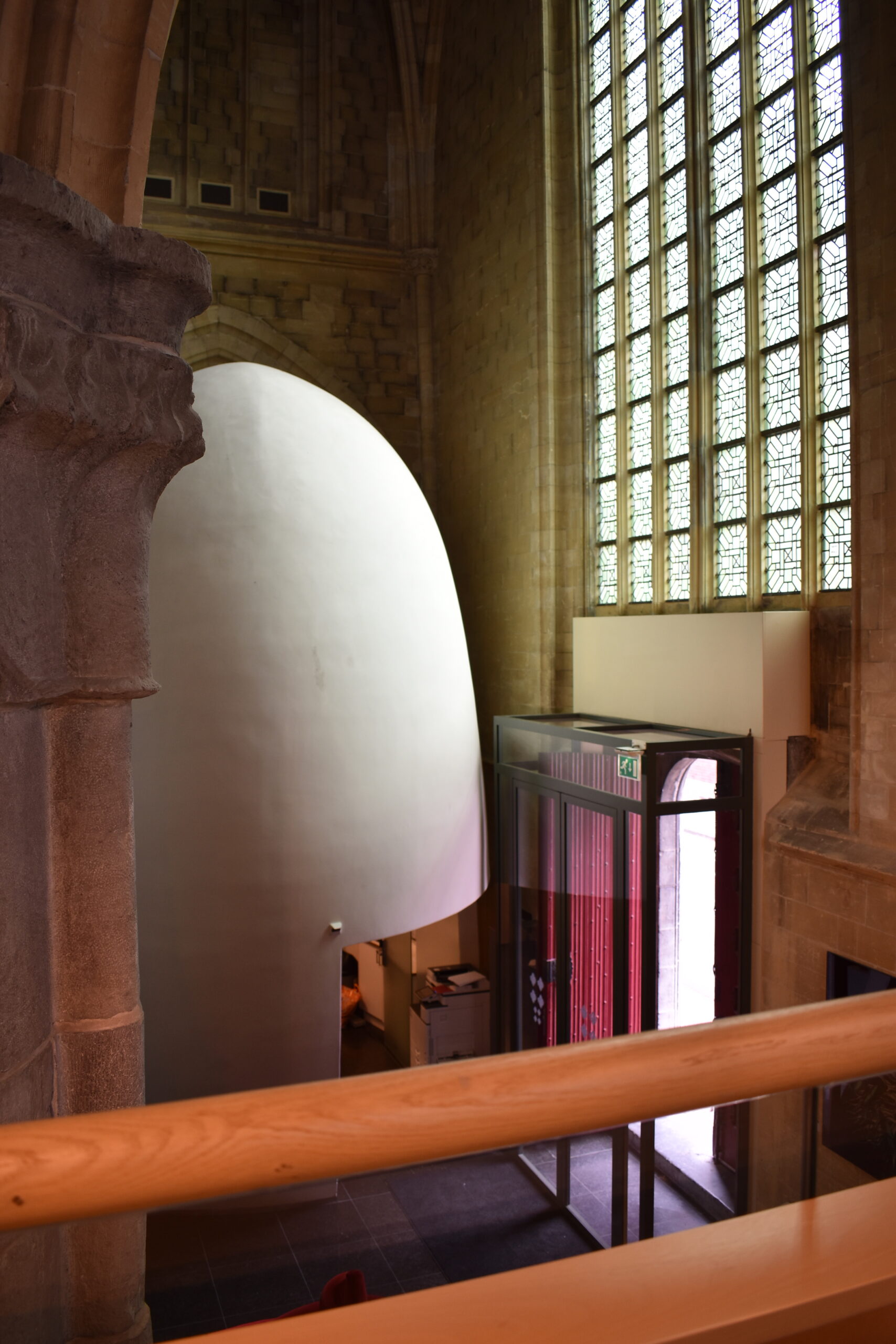

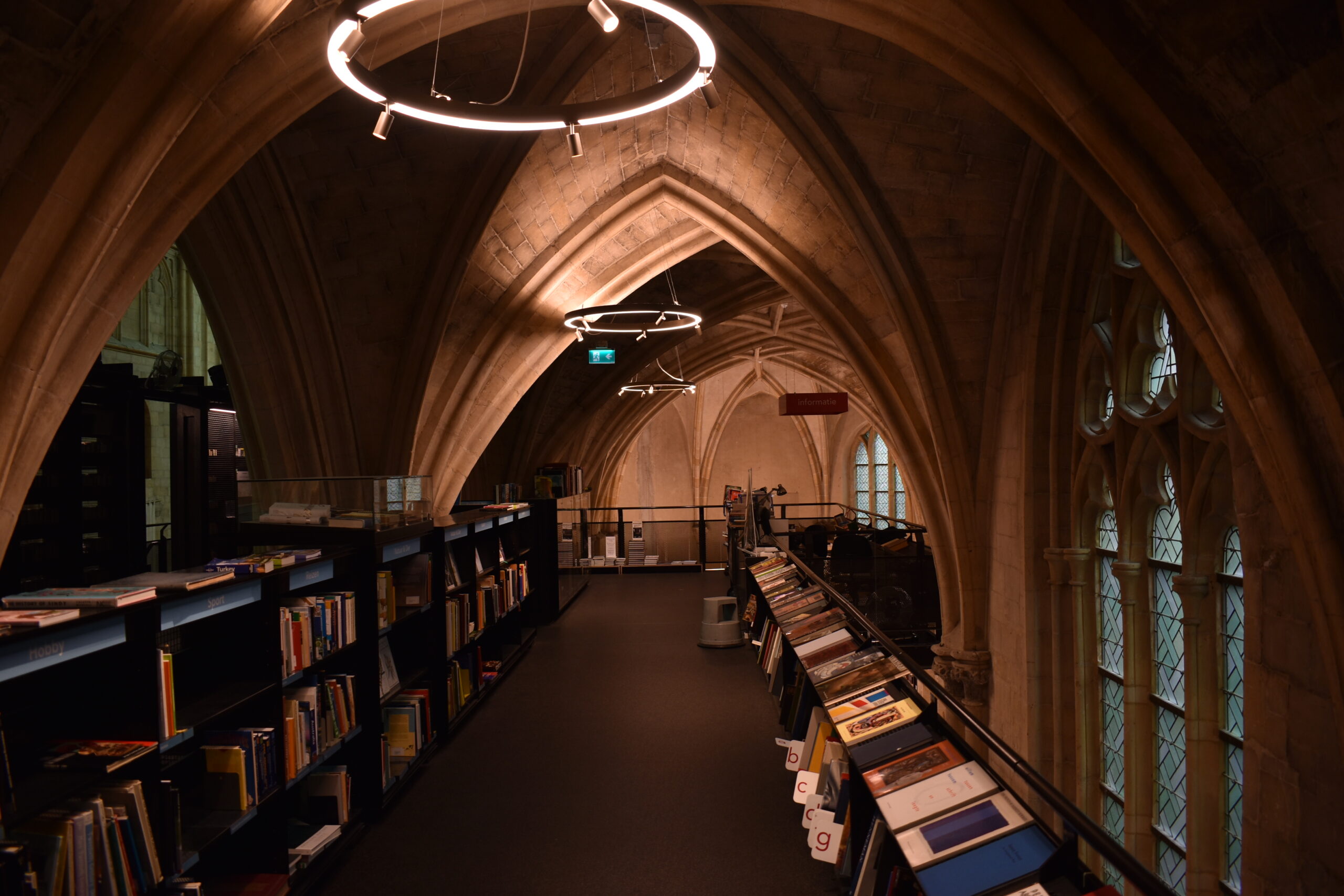
Kruisherenhotel charms because its architects clearly just had fun with the design, from the glass elevator to the copper tunnel entry to the gigantic pure white egg.
Originally, this used to be a monastery church that became barracks for the French military, then finally got turned into a hotel 17 years ago. The new addition occupies the center of the body of the nave in the form of a bar and conference room, and a restaurant placed on top of that, and the church aisle is occupied in a similar fashion by restrooms and a graceful seating area placed on top. The character of the intervention is intentionally in extremely sharp contrast to the existing. The earthen, solemn interior of the the church is almost totally obscured in front of (or more accurately, the background of) the bright reds and oranges of the intervention. Furthermore, the nave’s large expansive volume, which is the most theatric part of a cathedral, is occupied centrally by the hotel program, so one cannot fully experience its expanse.
Instead, the brilliance of the design is experienced in the perforation of the intervention — formally and materially. This allows a “shaken, not stirred” experience of the old and the new. The material palette brings together stone, wood, metal, glass, and plastic, and peeks of the stone cathedral through the forms of the intervention make the design light and non-monolithic.
A walk through Kruisherenhotel feels a bit like an adventure. The level ups and the downs, the little niches and nooks, and the creative liberties in the design all contribute to this. Also, adding an upper level does something very unexpected to the user’s experience — one experiences the church in a way never intended by the original builder. Seeing out of the stained-glass windows onto the street and having the beautiful glass within arm’s reach makes for an incredibly dynamic encounter with the building.
Orangerie
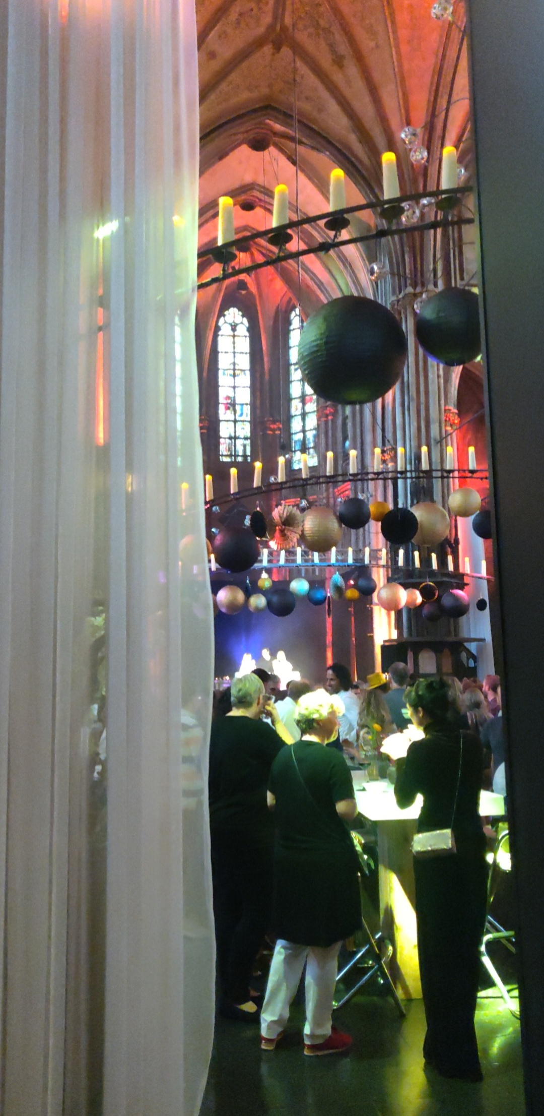
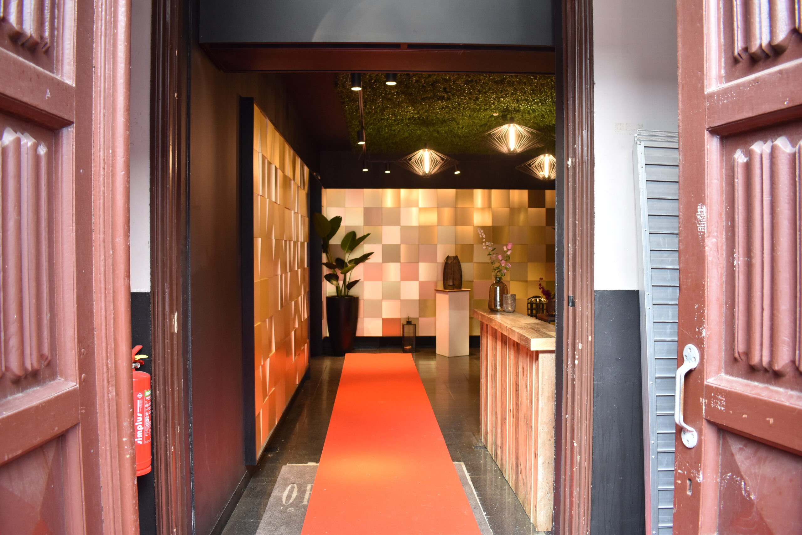
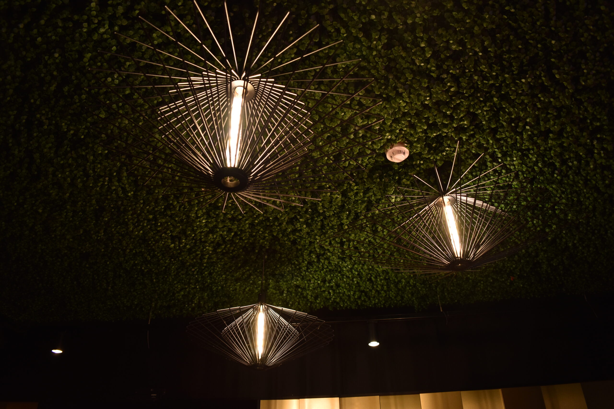
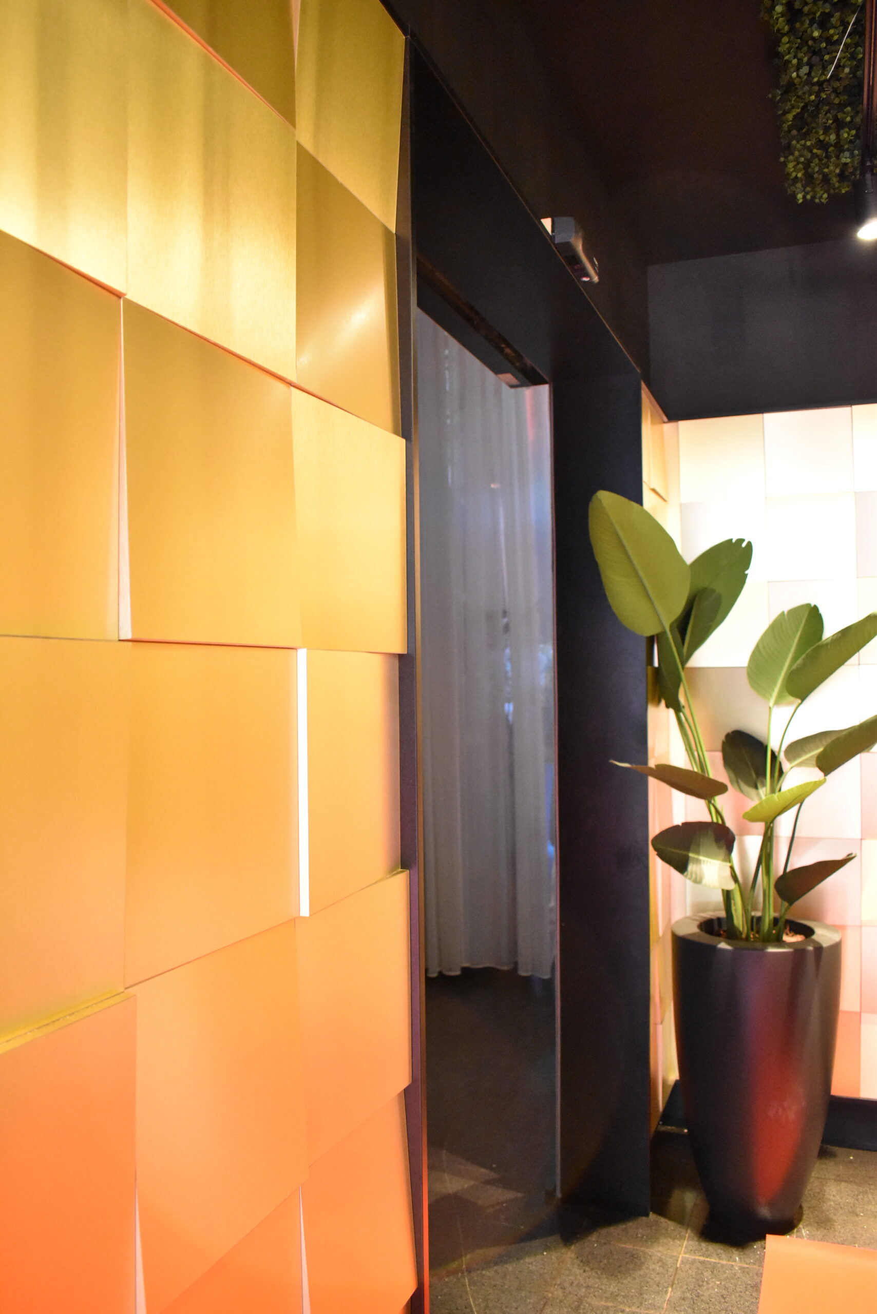

This place is lit! The architecture is beautifully and expertly lit up. Colorful lights complement and remind one of sacred stained glass. The church is intrinsically much more ornate and Gothic than nearby DePetrus. Whether through outside or artificially, the lit stained-glass windows don’t let you forget that this is a cathedral, as well as the columns and the beautiful aged unrestored stone with its patina.
There is so much life here. While there’s no solemnity, as a non-Christian I really like the vibe of the place. The spatial organization and the lighting contribute to a remarkable project. The building does not feel simply like a “container” but an integral part of the design. Also, the natural grid resulting from the columns has allowed the users to partition the space into smaller spaces burgeoning off from the central space. Curtains are added at strategic places for visibility, spatialization, and intimacy.
The altar is the central focus of the eye and the ear — this element has not changed over the centuries. The musicians are the priests here, elevated on the altar platform, under bright spotlights, banging away at their guitar strings.
Basic Fit – Bosscherweg
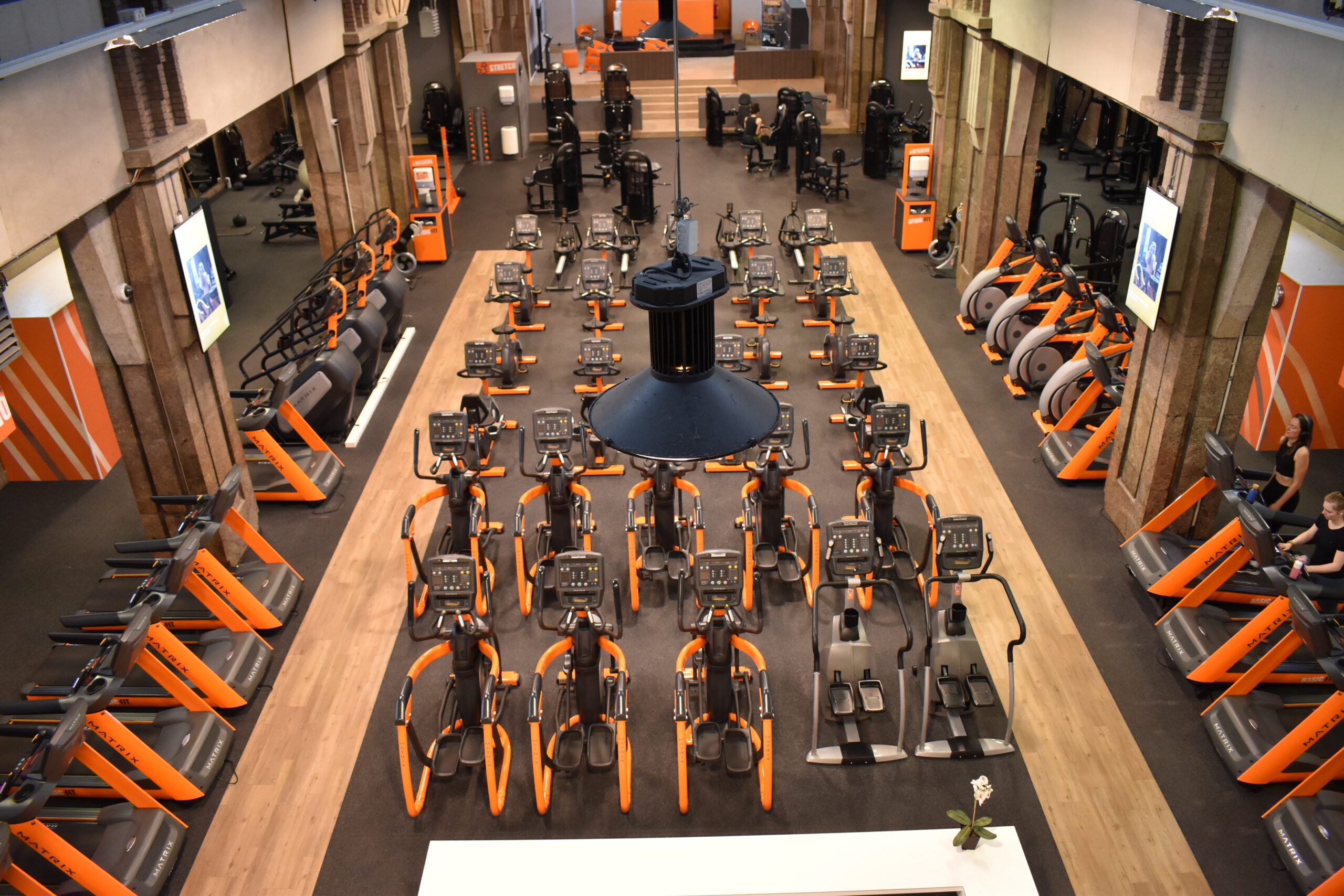
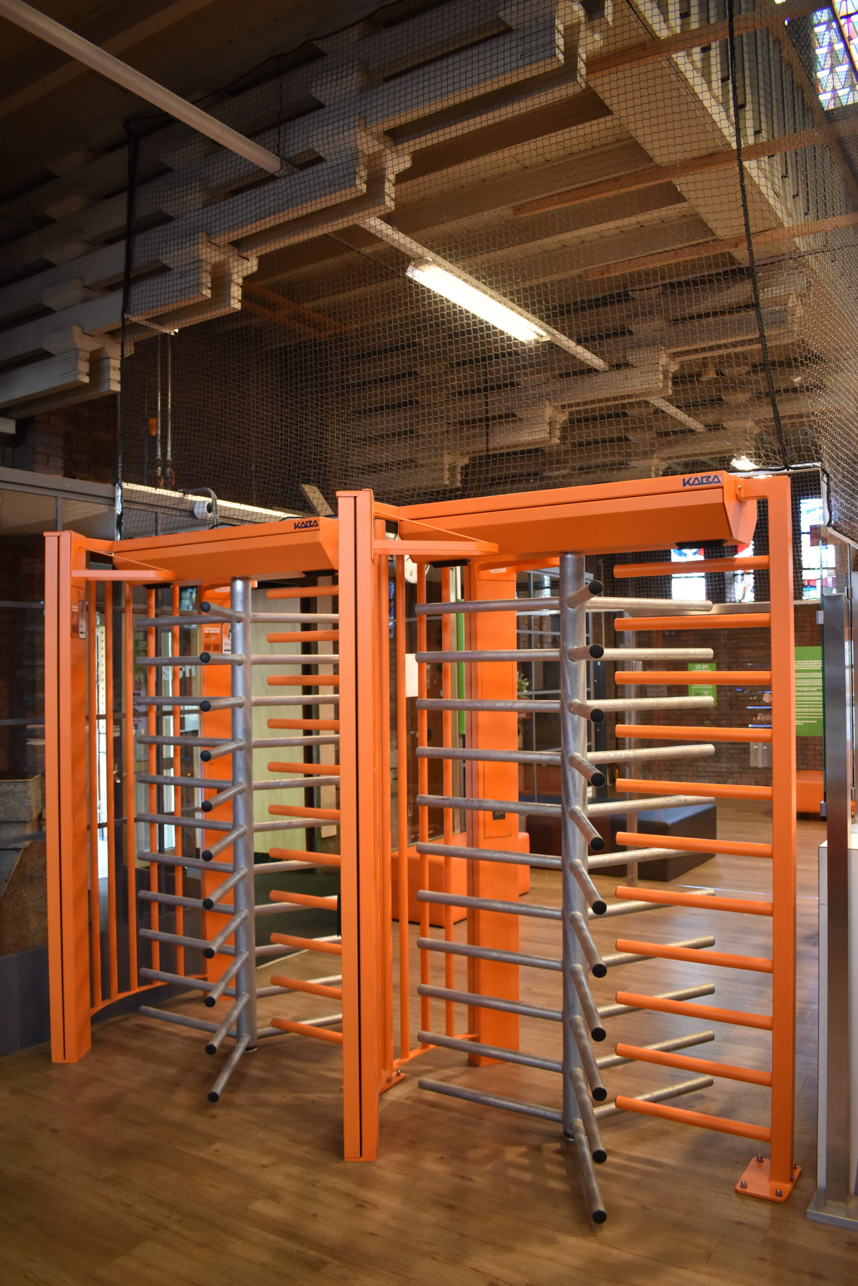
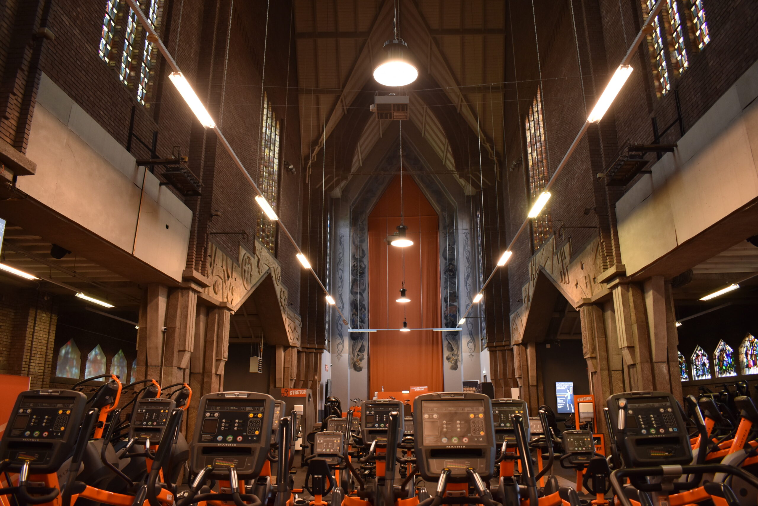

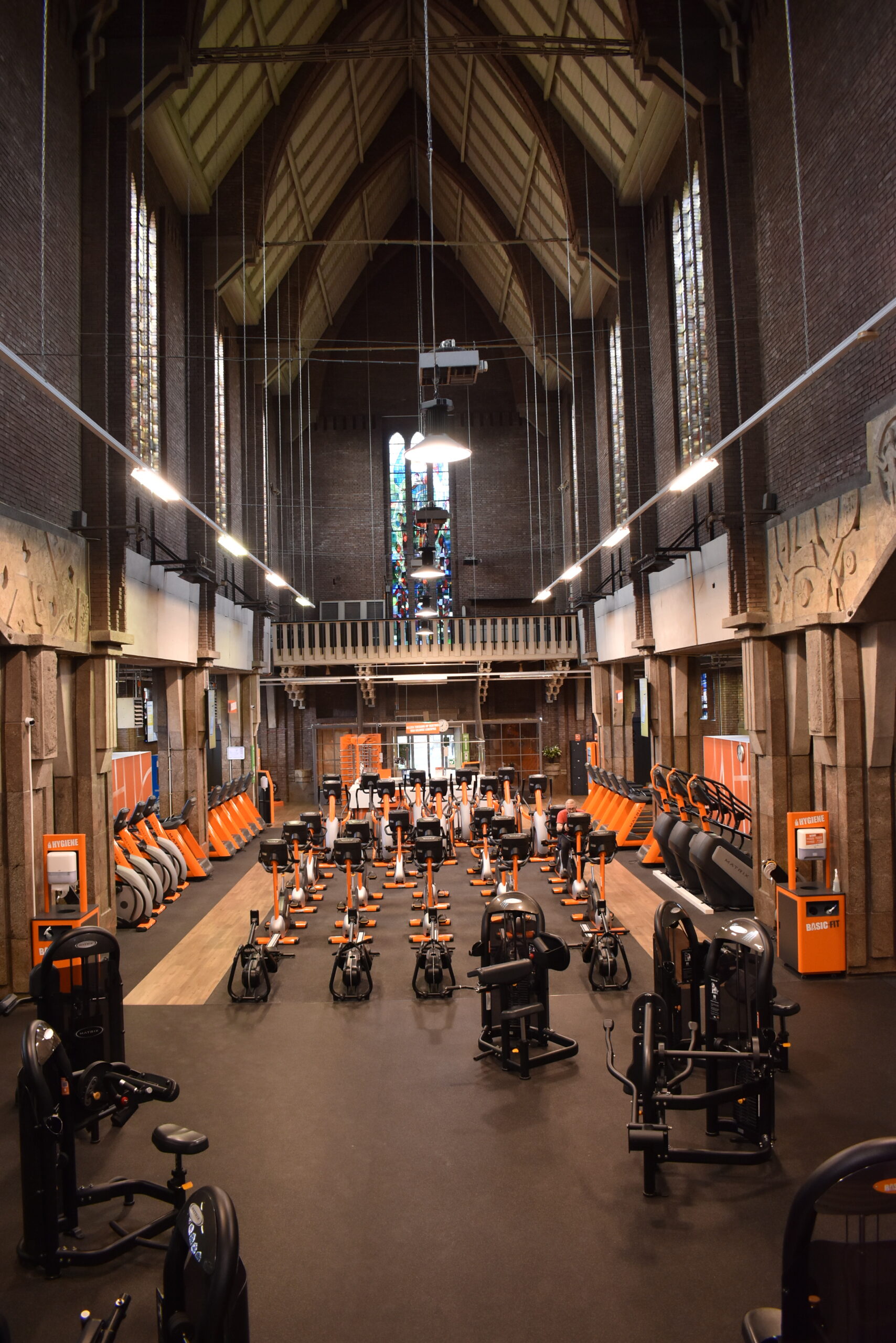


Like DePetrus, Bosscherweg is actually a pretty new church. It’s a Protestant church, only about 140 years old, and it’s clear that its design is not as classic Gothic as one might expect in a normal cathedral. Maybe in some ways that makes this building more conducive to being turned into an exercise gym.
A few minutes here reveal the aspirational confines of financial profitability. Because the building is a for-profit gym renting a place inside a building, the veneration of the place as sacred and beautiful is absent from the equation. One notices the badly retrofitted wiring, lighting, and infrastructure, as well as what I felt was a lack of cleanliness and upkeep of the building (especially those parts outside the immediate viewshed of the visitor).
Because of this reality, it ends up being that the intervention to the building is less architectural, and more so planning where the machines go and how heavily to brand the space with their color. This is done very well: the amount of orange isn’t too much, even though there’s orange everywhere. In fact, the orange curtain conceals the Christian vibe so that people can focus on working out. It’s a charged space, which perhaps needs to be neutralized … and then charged again, as a capitalist enterprise.
Interestingly, there was dissent on this from visitors. Some said they wished to not see any religious symbolism to distract from their workouts, and others said that this history should be preserved and not deliberately covered up.
The Bosscherweg church conversion into the Basic Fit gym prompted me to ask questions I hadn’t really dared to before. Is it possible to make it unrecognizable as a church? Should we completely own its transformation? For a non-historic church (cathedral), how much modification is acceptable? Imagine the ceiling painted orange!
Fatih Moskee
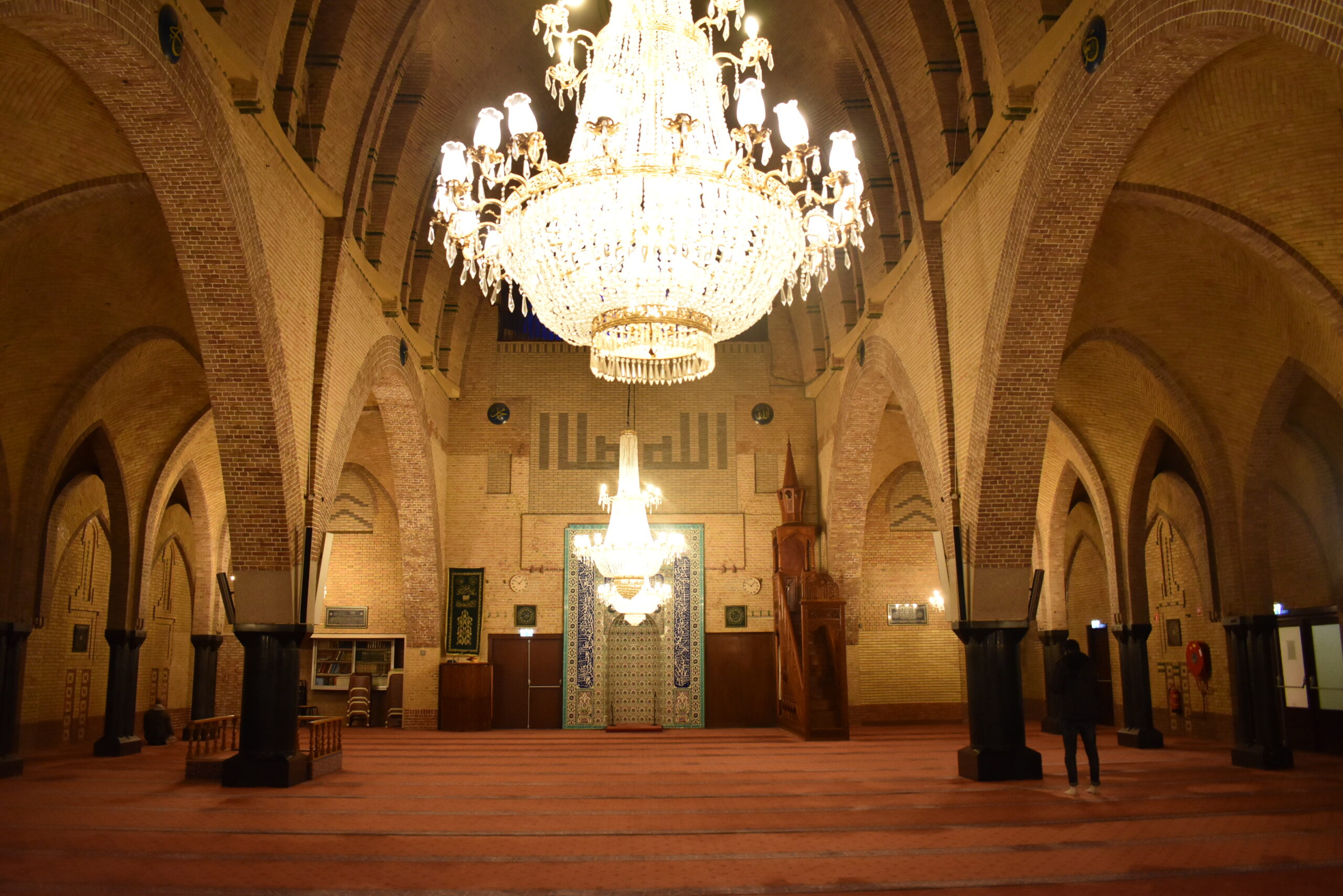

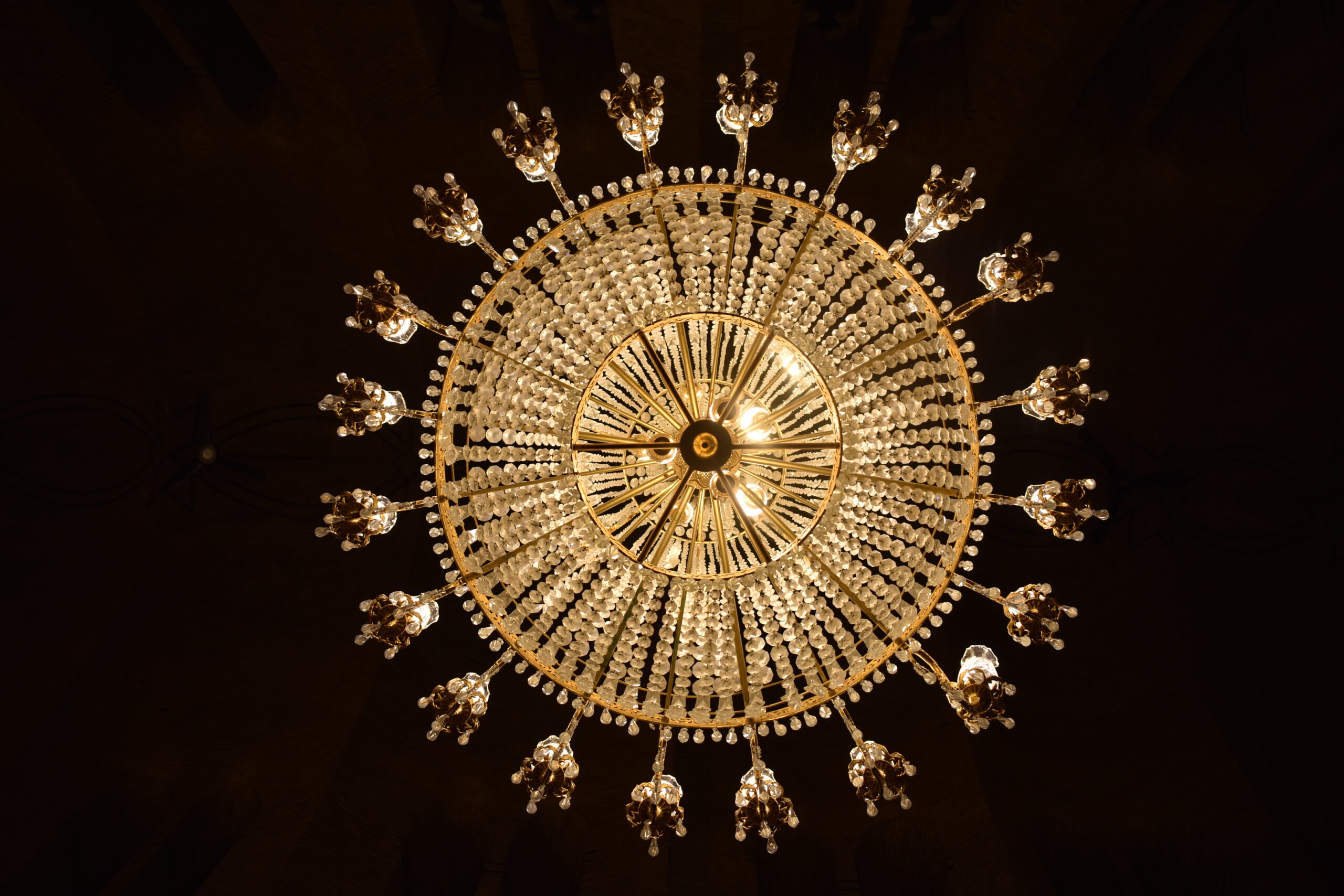
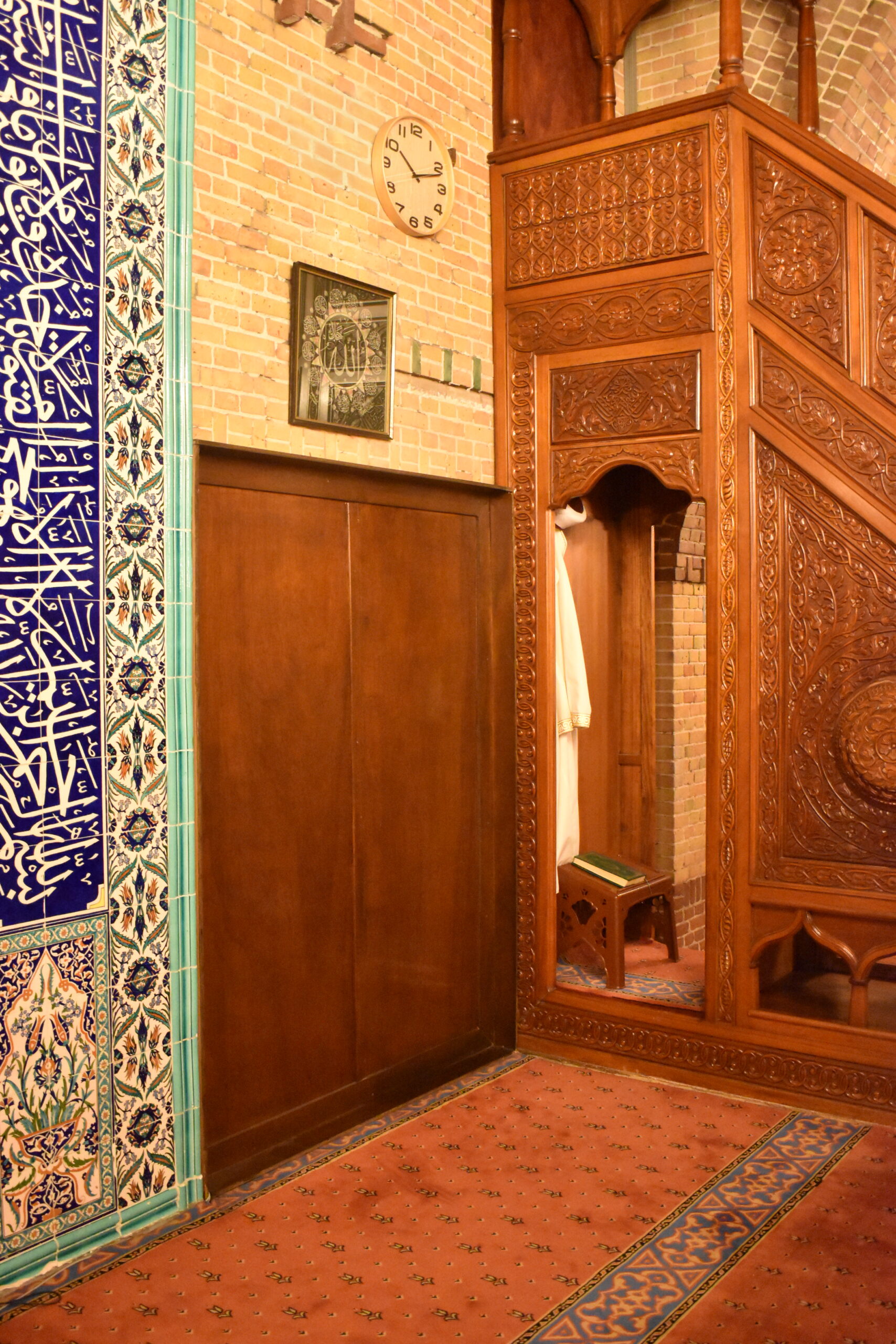
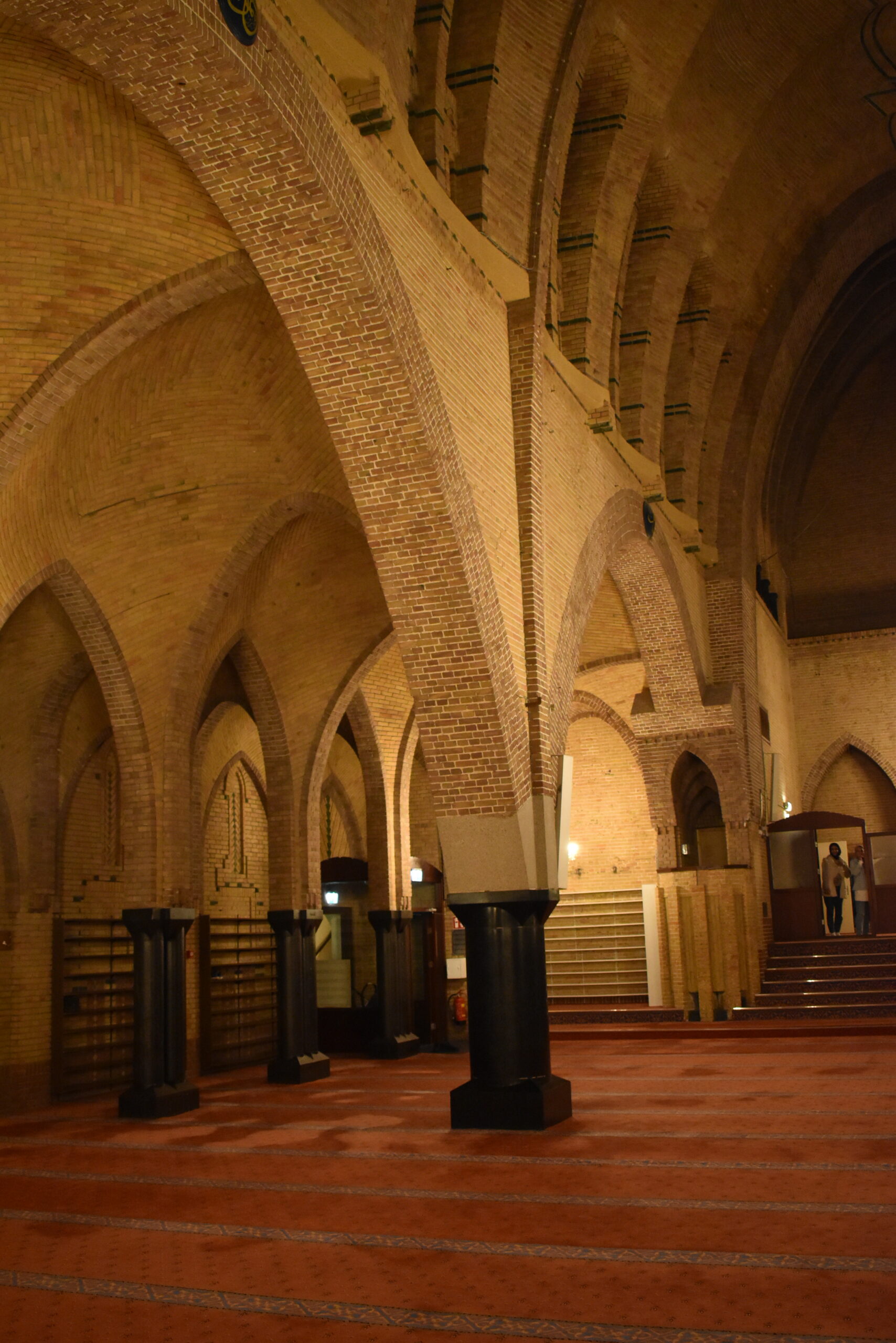
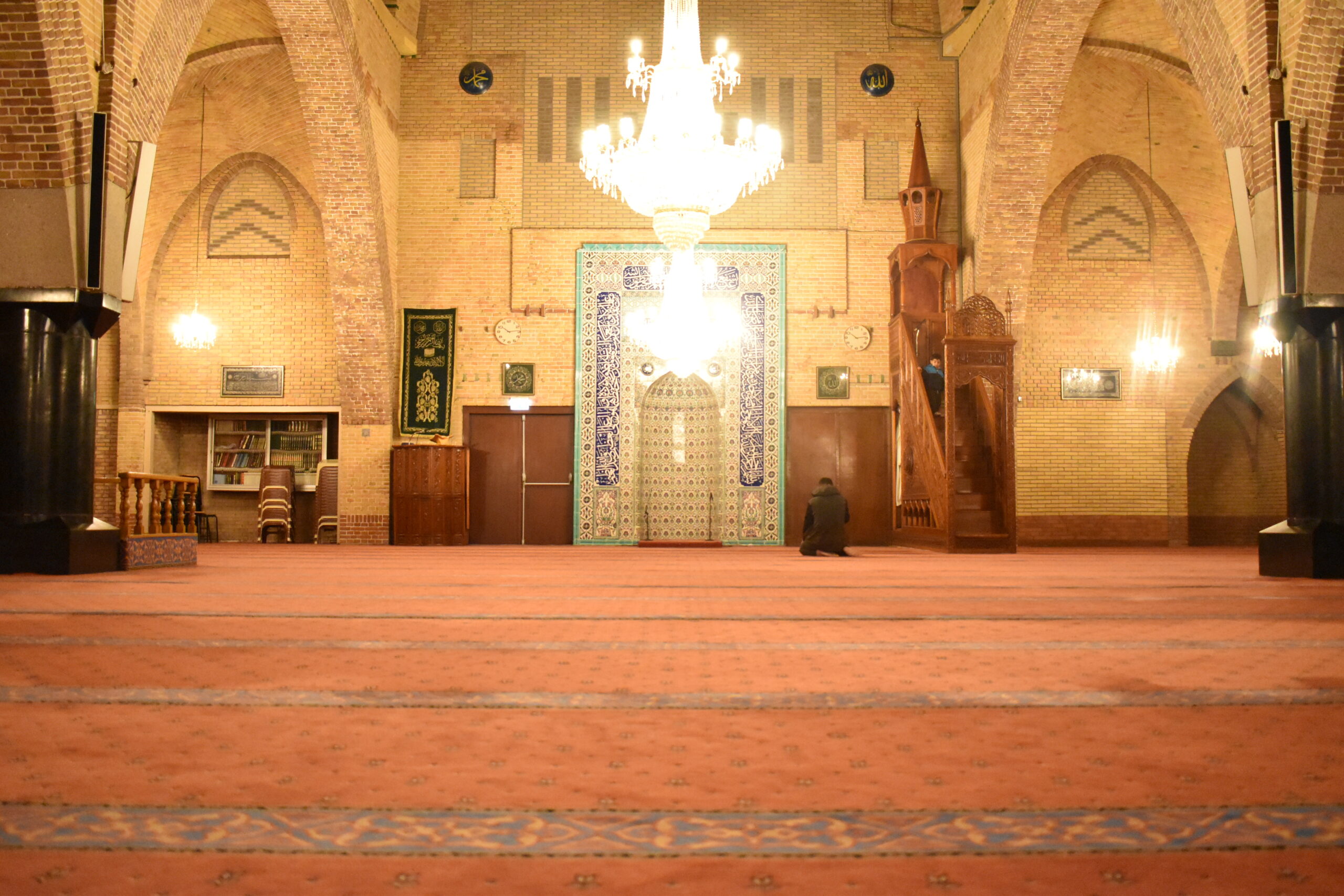

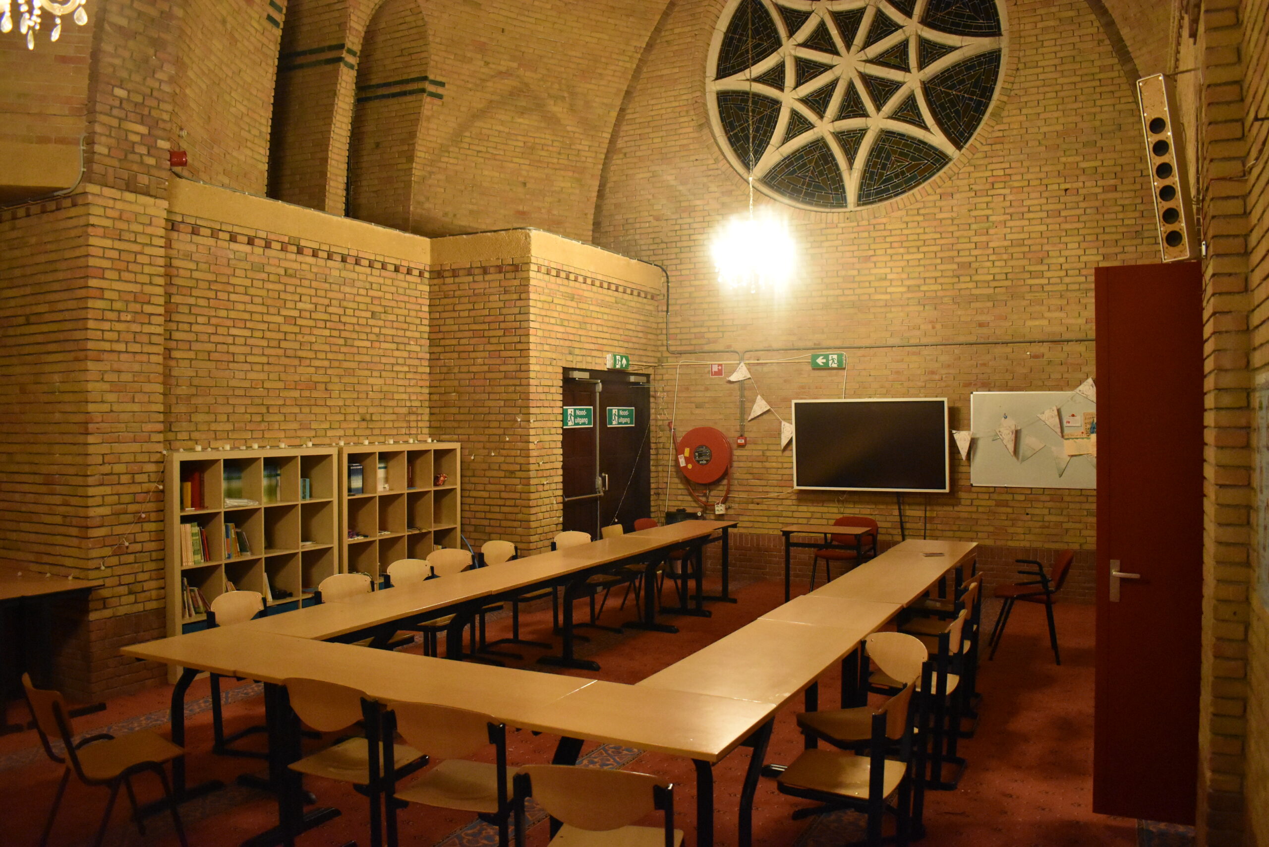
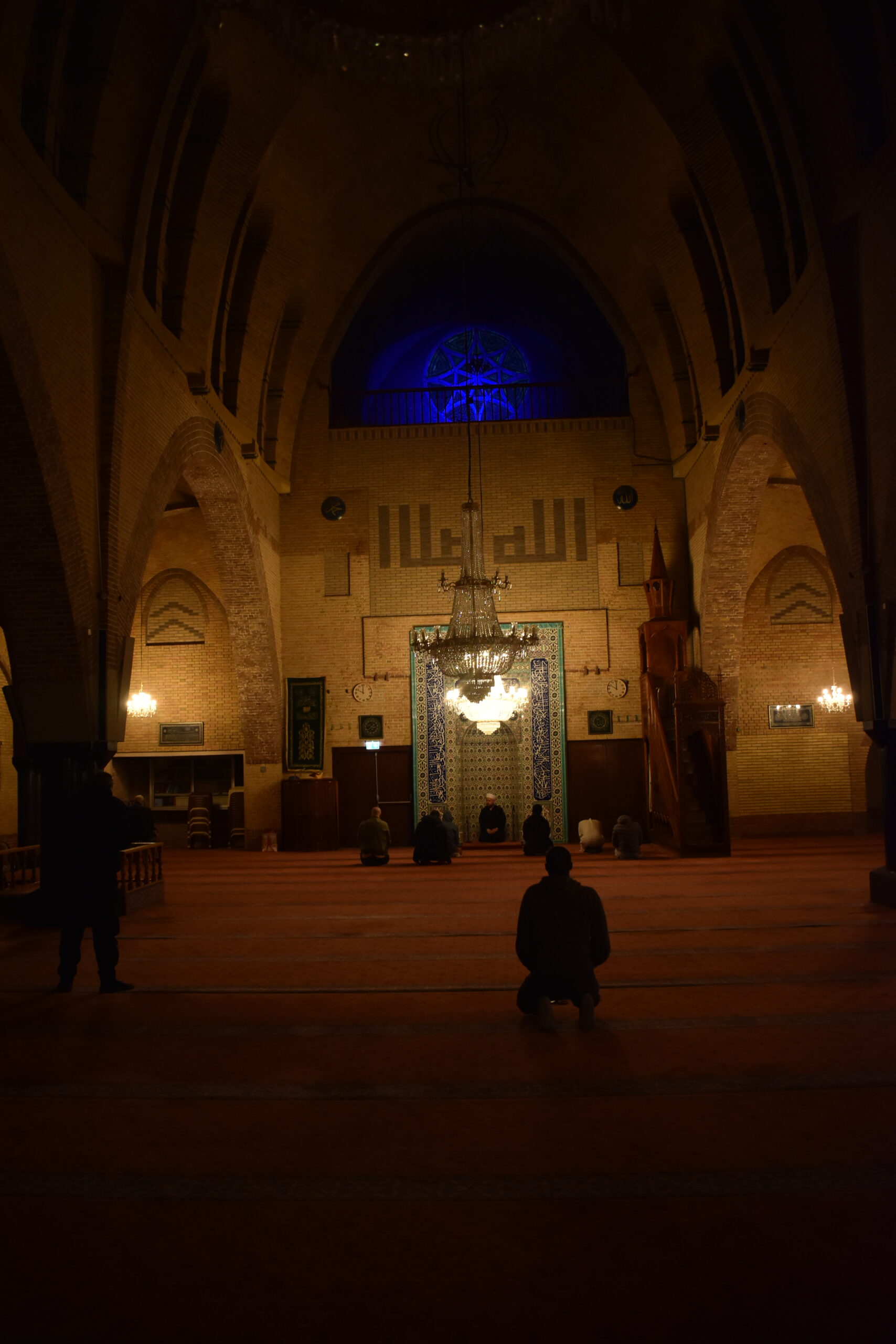
This Amsterdam church never stopped being a place of worship. Only now, it serves as a mosque for Muslims. I think nighttime was the best time to visit this mosque — as I felt that centuries old solemnity alive in the space. The church conversion here is a gentle one: mostly just placing shoe racks for convenience and making the floors carpeted for worshippers to kneel. One naive enough might even feel that this is a mosque built out of Christian forms. Coincidentally, even the wall of the church faces Makkah!
Taha K. Suhrawardy is an architectural associate with brwarchitects, p.c. and a 2020 Erwin-Ramsey Fellow. All images courtesy of the author.
