By William Richards
It wasn’t much of a surprise when Mecanoo and OTJ Architects’ renovation of the Martin Luther King, Jr. Memorial Library in downtown D.C. received accolades after it reopened in 2020. The $211 million project was honored for myriad reasons—as an example of a sensitive intervention within an iconic envelope, as a creative solution to some internal circulation challenges, and as a successful modernization of the library typology.
What I don’t think was talked about enough was the particular audacity of improving a Ludwig Mies van der Rohe design. It’s the kind of audacity that was only implied by most of these honors or talked about only obliquely by jurors, but it’s perhaps the most daunting thing you can ask an architecture firm (or two) to do: take on the Cartesian (and Miesian) orthodoxy like David took on Goliath.
It’s no small task to say the least.
Sure, we’d all seen the renderings before and during the renovation, and, sure, they looked great, but what would it be like when the library opened? Would it feel like the old MLK Library felt? (This was an unwelcome prospect for some who’d long felt it was a tarnished masterpiece.) Or, would it feel different? (Again, an unwelcome prospect for others who were fond of its maladaptions.)
Over the years, I’ve spent dozens of hours looking at the Washingtoniana Collection or looking through microfiche newspapers upstairs. The routine was the same each day: arrive and scoot through the lobby to the elevator—no time to waste. On occasion, though, I’d stop to watch what was going on in the lobby, and usually a lot was going on in what had become a kind of community center through the decades—unprogrammed, lightly monitored, a respite from summer’s sun or winter’s bite. It certainly didn’t feel like a library on the ground level and, in the north and south sections off the lobby, it seemed airy and bright in the same way that the Seagram Building lobby or Crown Hall both feel airy and bright. It felt special to be there.
Upstairs, though, was another story before the renovation. Cramped spaces created by weird, temporary walls and interminably dark corners made it feel unloved and decidedly unspecial. Of course, the darkness suited my microfiche reading just fine, but the entire scene offered nothing of the kinds of library experiences we crave—or demand—because of the likes of Henri Labrouste’s Bibliothèque Sainte-Geneviève, or the public libraries designed by Carrère and Hastings in New York, or McKim, Mead, and White in Boston, or OMA in Seattle. In these places, you ascend from the street, and even transcend the mortal coil. In D.C., the movement from the street into the elevators and to a ratty rolling chair wasn’t as graceful.
The public doesn’t always expect a grand civic experience at the local tax office or even at the local city hall, but they do expect that public libraries should honor their purpose. Maybe we’re spoiled thanks to Andrew Carnegie’s legacy of funding more than 1,600 public libraries nationwide (not to mention another 100 academic ones), some of which have a grandeur all their own, such as the central Carnegie Library in D.C., designed by Ackerman and Ross that the MLK Library replaced. Nevertheless, the public library in America long ago transcended its status as an amenity and reached the vaunted status of a right—a right of access and a right to the dignity of learning. In Carnegie’s time, that meant books and periodicals. In our time, that means far more.
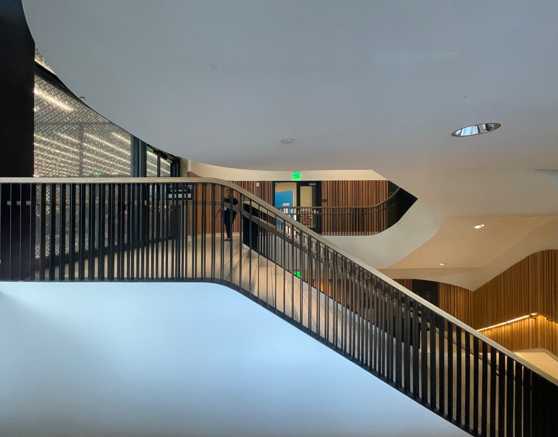
The new, 450,000 square-foot MLK Library is a thoroughly modern civic hub (that also happens to have books). It has a recording studio and a dance studio. It has an auditorium that seats nearly 300 people, and a fabrication lab that accommodates 3D printing, circuitry, and sewing. Galleries, gardens, and a green roof offer flexible spaces and helped the design team realize a LEED Silver certification. It’s the only library Mies ever designed and the only central library D.C. will ever need—for a while, anyway.
Last week, I promised to take my teenage daughter record shopping to mark the end of the school year, but I also convinced her to take a detour with me despite the words “library” and “let’s go.” We watched people doing library things. We played with the card catalog kiosks. We watched a small stage go up for what would probably be a book reading or lecture. We took some pictures. We watched people discover the new stairwell and delight in going up and running down. We basically just hung out, doing things that were unrelated to reading, and we enjoyed it.
Is there any audacity in doing those things in a Mies building? Probably not. But, there is a sense that the library’s doors are always open, whether you’ve come to read or study or write (or attend a lecture, or even dance or sew). Reflecting on Mecanoo and OTJ’s renovation, which received an AIA Virginia Award of Honor in 2022, they’ve done more than modernize the city’s crown jewel. They’ve reestablished something that Washingtonians have come to expect and deserve, which is the dignity that only a public library can confer on the public. Dare I say they did it better than Mies could have?
William Richards is a writer and the Editorial Director of Team Three, an editorial and creative consultancy based in Washington, DC.

