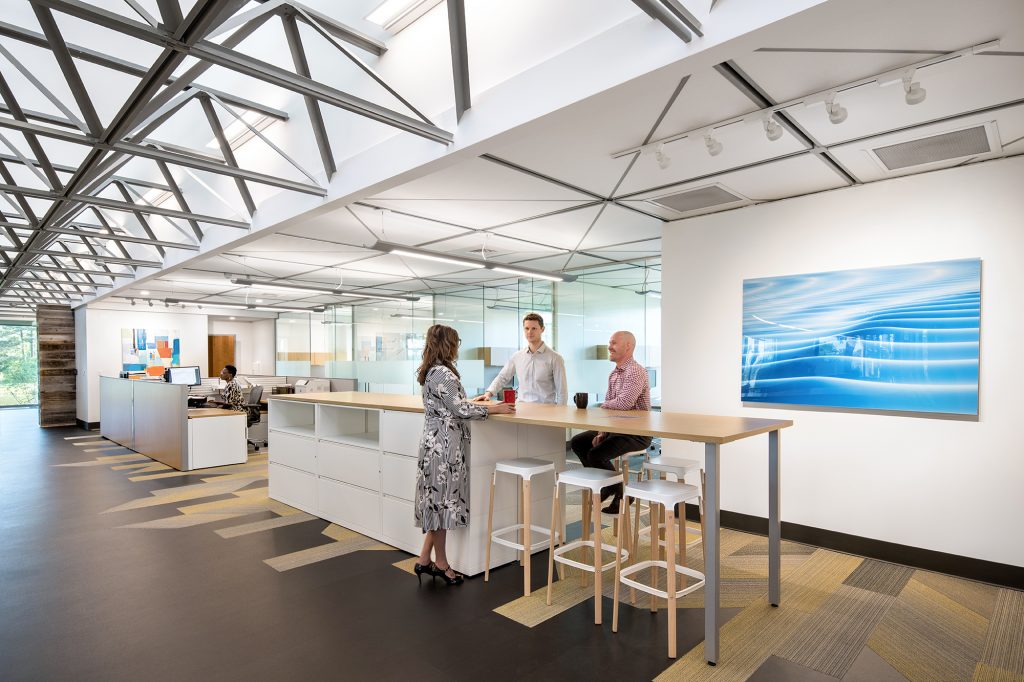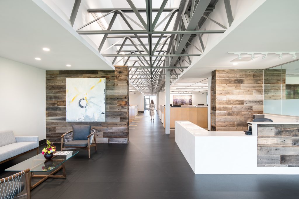
VIA design architects utterly transformed a dark 1970s prototype structure for Allan Myers, infusing it with natural light and integrating the owner’s branding to create a fresh, modern, and open space.
Allan Myers, an infrastructure construction company, was founded in 1939 from humble beginnings on the Myers’ family farm located in Worcester, Pennsylvania. Four generations of family ownership, heritage and growth has led to their most recent expansion on an industrial site located on the Southern Branch of the Elizabeth River in Chesapeake, Virginia.
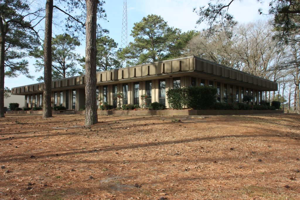
Before 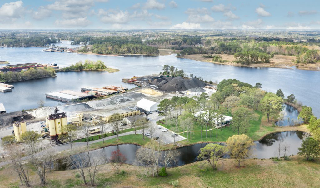
Aerial
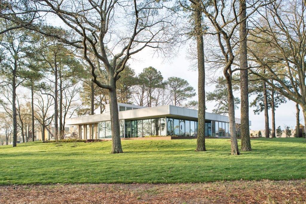
The purchase of this existing complex of structures supports the fabrication and distribution of asphalt from Richmond to Virginia Beach managed from this new regional headquarters site. This building is an early 1970s prototype structure identical to the prototype design Virginia Division of Motor Vehicles rubber stamped around the state. It is a simple rectilinear box with a repetitive floor-to-ceiling precast concrete and glass panel pattern on all 4 sides, perched on an elevated foundation. There is no sense of front, back, side or where one should enter. The interior followed suit with ‘‘Mad Men’’ genre of dark dingy materiality, décor, left behind furnishings and virtually no natural light. A real beaut!
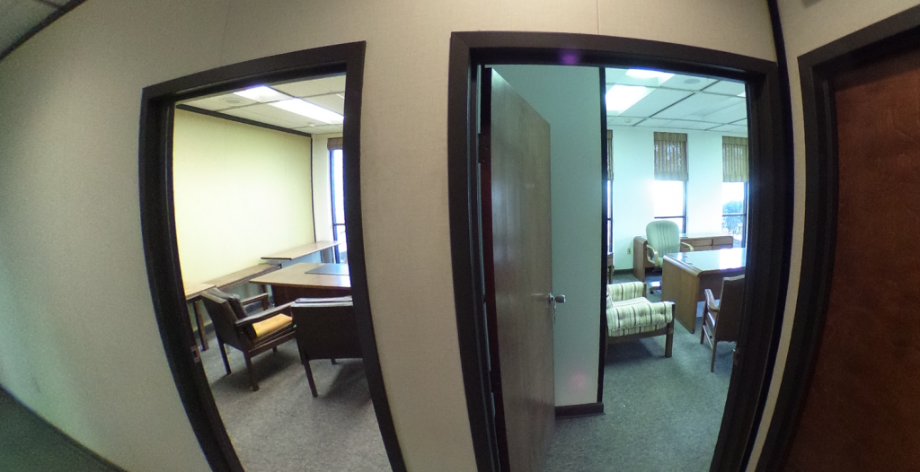
Before: Offices from Hallway 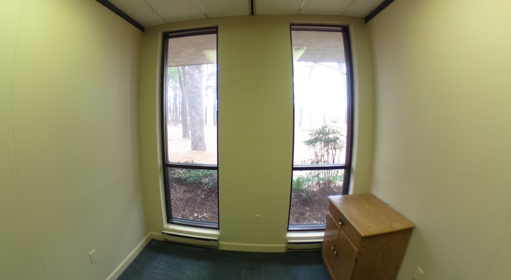
Before: Office Interior
The Challenge
Transform this workplace to meet the next generation’s appetite for quality design representative of the Allan Myers culture, ‘‘Image of Excellence.’’ Address the need for a sense of entry, bring natural daylight into the workspaces and connect the beautiful natural surrounding landscape with the interior and the company brand.
VIA design’s initial fieldwork led to a beautiful discovery; the building’s superstructure is a perfect 5x5x5 steel space frame structure. This opened a world of opportunities and freedom for the redesign since the walls were not bearing and there were minimum column support points within the floor plan.
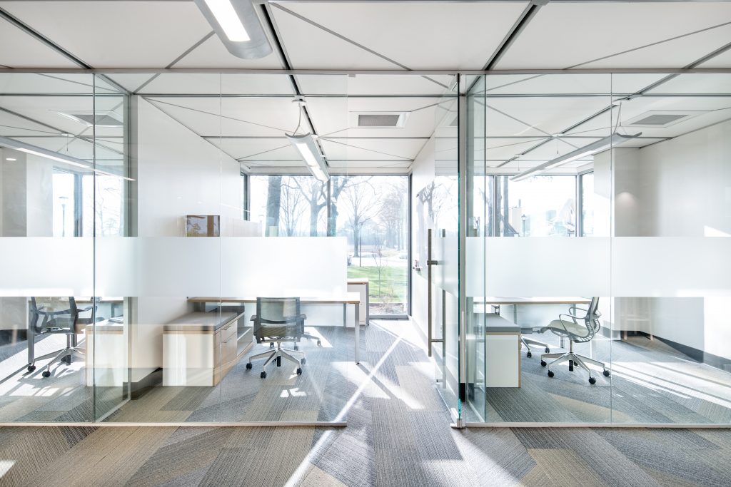
After: Offices from Hallway 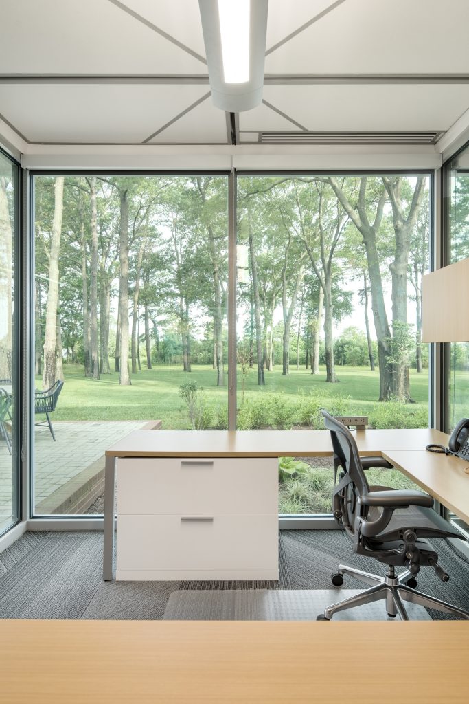
After: Office Interior
Let There Be Light
Daylighting sources became the guiding and diagramming tool to inform the design, define entry, organize circulation, and seamlessly connect the interior to the exterior. Daylighting models revealed the need to:
- Strategically open the roof in the center of the building to gather light
- Modify the exterior envelope by select removal of precast panels and replace with storefront infill
- Deploy an interior floor to ceiling glass wall and door system
These 3 tools became the design and are each multi-tasked to the highest level to accentuate and maximize the existing positive attributes of this 1970s building.
TOOL 1: A central skylight monitor stretching northeast to southwest is multi-tasked.
- The monitor exposes the beautiful repetitive pattern of the space frame and expresses the industrial heavy construction character/brand of the company’s business;
- The monitor allows bright south-westerly light to filter and reflect into the center of the building;
- The monitor defines entry on the northeast side for visitors and clients as well as exit/entry for staff on the southwest side whom traffic in and out of the building daily to access the asphalt production areas of the property;
- The monitor organizes the interior circulation and programmatic functions allowing the open collaborative work areas to share this beautiful bright lofted space.
TOOL 2: A new storefront infill pattern is equally multi-tasked.
- The infill nodes strategically expand the footprint to capture much needed additional square footage for the program;
- The new infill nodes extend to the outer edge of the existing roof overhang capturing additional daylight;
- The new infill nodes support entry definition and prime private office real estate;
- The new infill nodes exaggerate the transparency goal and make the indoor spaces seamless with the outdoor spaces.
TOOL 3: An all glass NELLO WALL system is the final touch for a complete indoor-outdoor integrated success
- This system supports 100% daylight transparency from all sides of the building footprint;
- This system is deceiving in that it promotes a sense of an open office design, while in fact there is incredible privacy;
- This system respects the space frame 5-foot ceiling grid and expresses the existing geometric pattern with super intention.
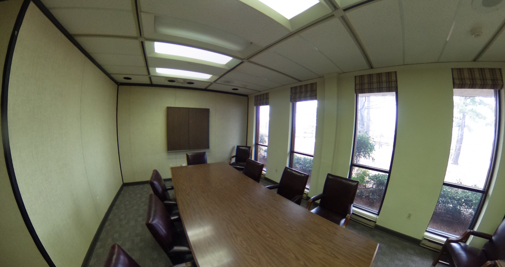
Before: Conference Room 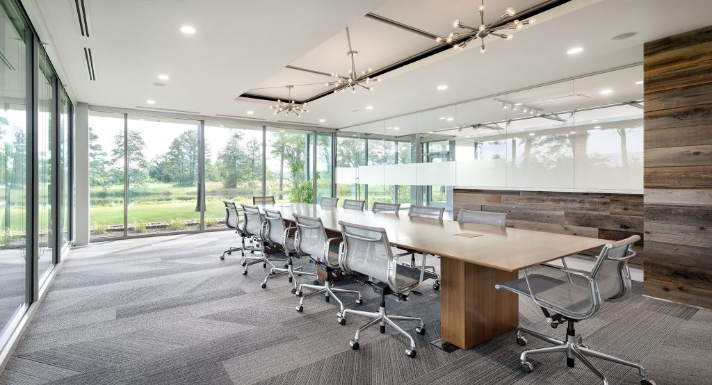
After: Conference Room
Branding by Design
Clean, simple fresh lines integrated with reclaimed barnwood panels capture the spirit of the next generation’s heritage and modern flair as well as the originating character of the first 1939 Pennsylvania office on the family’s historic farm. The final touches subtly integrate the Allan Myers black and yellow company colors into the carpet and LVT flooring patterns, bring forward carefully selected fine art, furnishings and equipment, and indirect artificial light for that ‘‘Image of Excellence.’’
