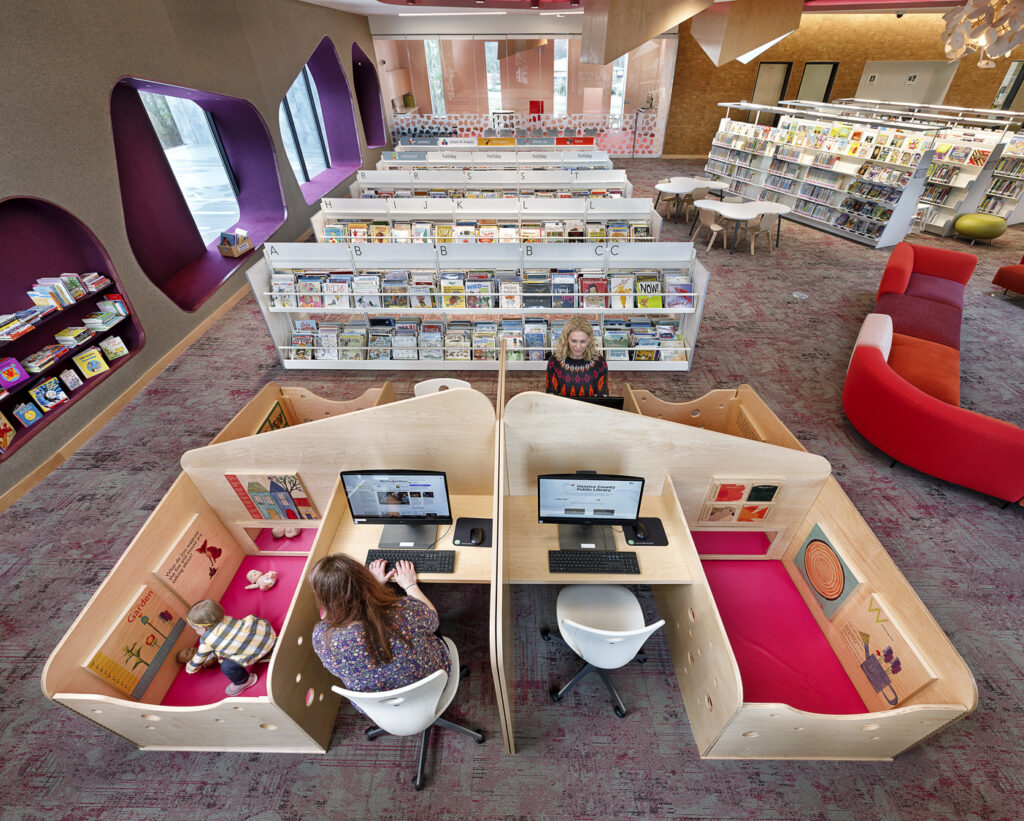
Opened in 2019, Quinn Evans’ Fairfield Library project featured a custom workstation that updates the classic library carrel to incorporate self-directed learning for children and peace of mind for caregivers. In this interview, Shannon Wray, a senior interior designer at Quinn Evans, talks about the discovery process and the iterations that led to a 2020 IIDA/ASID IDEA Interior Design Excellence Award for the hybrid workstation and play space. “It creates privacy and it also fosters community and conviviality,” she says, “but to get there, we had a bunch of little ‘ah-ha’ moments that lead to the final design.”
Tell me about the charrettes with the client. Why did you choose this method of testing ideas?
The charrette process worked for us because it allowed us to tease out all of the nuances of the client’s needs and the users’ needs. The conversation took place over more than a series of months, and it was something that, as we talked about the library’s furniture—and we’d done two libraries already with this client, so we had a good sense—but we paused and asked why this library was different. As libraries, they see voids and needs that they aren’t always given the space or opportunity to articulate, so because we knew the client so well, we created a circumstance where we could talk about the struggles they go through each day, what their patrons are like, and how furniture, in particular, can help address their challenges. They said that one thing they struggle with is a high demand for computer use because the demographics of their patrons means they need this resource. They may lack technology resources at home, and so they rely on the library for access to computers and the internet. But, we find that many of the Fairfield community’s patrons have young children in their care each day—single parents, working parents, grandparents who are caregivers.
Where did the design start and what sorts of questions did you raise in the very beginning?
We hadn’t seen many products on the market that spoke to the needs the client described. So, we met in our office around a big table with trace paper and markers and we diagrammed everything. How many patrons need this resource? How open should the carrels be? Should the children be separated from each other and their parents, or should they be able to comingle with other children? In terms of an iterative process driven by questions, we definitely had the idea of a big, boxy shape that softened over time where notions of public and private could play out, allowing both to exist together.
How did the design evolve through the charrette process?

We diagrammed several iterations that include different sizes, shapes, levels of enclosure and permeability. Safety and security were an important consideration in the overall design, as was the need to minimize distractions from the surrounding library space. We had to think about safety and security, so we focused on each carrel being adjacent but separate. It had to have a play component for the child, so there was a learning opportunity. Maybe it’s a child who is immoble in a baby carrier. Maybe it’s a crawling or barely walking toddler. Maybe slightly older. As we brainstormed ideas, the primary design driver was having a productive, comfortable work space that would support desktop computing as well as space for a patron to spread out their own materials. The secondary design driver was making sure that the accommodations for the child allowed them to be physically adjacent and visually connected to their parent or caregiver. What evolved is a modern interpretation of the traditional library study carrel. For the adult that’s about three feet wide for a computer and a keyboard and papers, and an adjacent space for the child that obviously separates from the adult, but visually connected. So, that’s how we arrived at the conventional library carrel form.
The stations seem to offer a classic arrangement of elements as you’d find at, say, IBM in the 1950s. But, I also see elements of more freeform modular Italian design of the 1960s. What sorts of precedents did you consider?
We referenced the classic wood library study carrel as the symbol for heads-down productive work in the library, but we wondered how it could be transformed to be more ergonomic for today’s patron and accommodating for a child. The overall design character for the children’s space had already been developed, which included biomorphic shapes and patterns. To make sure that the study/play carrels felt integrated into the overall architecture and design of the space, we used those biomorphic shapes to inform the design of the carrel. That was the starting point for the shape of these carrels, and the beauty of it was a perfect hybrid of a softened and informal space, as well as a highly programmed space.
About the author
William Richards is a writer and editorial consultant based in Washington, D.C. From 2007 to 2011, he was the Editor-in-Chief of Inform Magazine.
